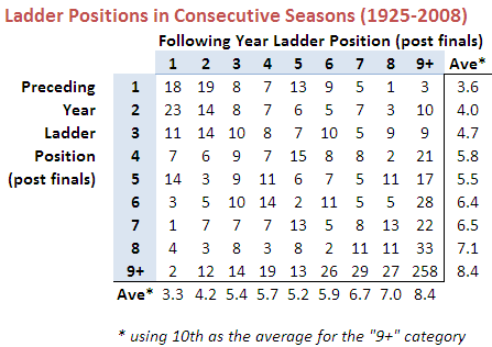
Does The Favourite Have It Covered?

You've wagered on Geelong - a line bet in which you've given 46.5 points start - and they lead by 42 points at three-quarter time. What price should you accept from someone wanting to purchase your wager? They also led by 44 points at quarter time and 43 points at half time. What prices should you have accepted then?

In this blog I've analysed line betting results since 2006 and derived three models to answer questions similar the one above. These models take as inputs the handicap offered by the favourite and the favourite's margin relative to that handicap at a particular quarter break. The output they provide is the probability that the favourite will go on to cover the spread given the situation they find themselves in at the end of some quarter.

The chart below plots these probabilities against margins relative to the spread at quarter time for 8 different handicap levels.

Cover_Q1_Chart.png

Negative margins mean that the favourite has already covered the spread, positive margins that there's still some spread to be covered.

The top line tracks the probability that a 47.5 point favourite covers the spread given different margins relative to the spread at quarter time. So, for example, if the favourite has the spread covered by 5.5 points (ie leads by 53 points) at quarter time, there's a 90% chance that the favourite will go on to cover the spread at full time.

In comparison, the bottom line tracks the probability that a 6.5 point favourite covers the spread given different margins relative to the spread at quarter time. If a favourite such as this has the spread covered by 5.5 points (ie leads by 12 points) at quarter time, there's only a 60% chance that this team will go on to cover the spread at full time. The logic of this is that a 6.5 point favourite is, relatively, less strong than a 47.5 point favourite and so more liable to fail to cover the spread for any given margin relative to the spread at quarter time.

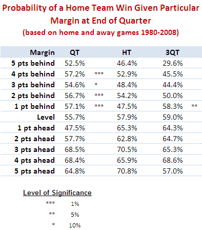
Another way to look at this same data is to create a table showing what margin relative to the spread is required for an X-point favourite to have a given probability of covering the spread.

Cover_Q1_Table.png

So, for example, for the chances of covering the spread to be even, a 6.5 point favourite can afford to lead by only 4 or 5 (ie be 2 points short of covering) at quarter time and a 47.5 point favourite can afford to lead by only 8 or 9 (ie be 39 points short of covering).

The following diagrams provide the same chart and table for the favourite's position at half time.

Cover_Q2_Chart.png
Cover_Q2_Table.png

Finally, these next diagrams provide the same chart and table for the favourite's position at three-quarter time.

Cover_Q3_Chart.png
Cover_Q3_Table.png

I find this last table especially interesting as it shows how fine the difference is at three-quarter time between likely success and possible failure in terms of covering the spread. The difference between a 50% and a 75% probability of covering is only about 9 points and between a 75% and a 90% probability is only 9 points more.

To finish then, let's go back to the question with which I started this blog. A 46.5 point favourite leading by 42 points at three-quarter time is about a 69.4% chance to go on and cover. So, assuming you backed the favourite at $1.90 your expected payout for a 1 unit wager is 0.694 x 0.9 - 0.306 = +0.32 units. So, you'd want to be paid 1.32 units for your wager, given that you also want your original stake back too.

A 46.5 point favourite leading by 44 points at quarter time is about an 85.5% chance to go on and cover, and a similar favourite leading by 43 points at half time is about an 84.7% chance to go on to cover. The expected payouts for these are +0.62 and +0.61 units respectively, so you'd have wanted about 1.62 units to surrender these bets (a little more if you're a risk-taker and a little less if you're risk-averse, but that's a topic for another day ...)

Are Footy HAMs Normal?

Okay, this is probably going to be a long blog so you might want to make yourself comfortable.

For some time now I've been wondering about the statistical properties of the Handicap-Adjusted Margin (HAM). Does it, for example, follow a normal distribution with zero mean?

Well firstly we need to deal with the definition of the term HAM, for which there is - at least - two logical definitions.

The first definition, which is the one I usually use, is calculated from the Home Team perspective and is Home Team Score - Away Team Score + Home Team's Handicap (where the Handicap is negative if the Home Team is giving start and positive otherwise). Let's call this Home HAM.

As an example, if the Home Team wins 112 to 80 and was giving 20.5 points start, then Home HAM is 112-80-20.5 = +11.5 points, meaning that the Home Team won by 11.5 points on handicap.

The other approach defines HAM in terms of the Favourite Team and is Favourite Team Score - Underdog Team Score + Favourite Team's Handicap (where the Handicap is always negative as, by definition the Favourite Team is giving start). Let's call this Favourite HAM.

So, if the Favourite Team wins 82 to 75 and was giving 15.5 points start, then Favourite HAM is 82-75-15.5 = -7.5 points, meaning that the Favourite Team lost by 7.5 points on handicap.

Home HAM will be the same as Favourite HAM if the Home Team is Favourite. Otherwise Home HAM and Favourite HAM will have opposite signs.

There is one other definitional detail we need to deal with and that is which handicap to use. Each week a number of betting shops publish line markets and they often differ in the starts and the prices offered for each team. For this blog I'm going to use TAB Sportsbet's handicap markets.

TAB Sportsbet Handicap markets work by offering even money odds (less the vigorish) on both teams, with one team receiving start and the other offering that same start. The only exception to this is when the teams are fairly evenly matched in which case the start is fixed at 6.5 points and the prices varied away from even money as required. So, for example, we might see Essendon +6.5 points against Carlton but priced at $1.70 reflecting the fact that 6.5 points makes Essendon in the bookie's opinion more likely to win on handicap than to lose. Games such as this are problematic for the current analysis because the 'true' handicap is not 6.5 points but is instead something less than 6.5 points. Including these games would bias the analysis - and adjusting the start is too complex - so we'll exclude them.

So, the question now becomes is HAM Home, defined as above and using the TAB Sportsbet handicap and excluding games with 6.5 points start or fewer, normally distributed with zero mean? Similarly, is HAM Favourite so distributed?

We should expect HAM Home and HAM Favourite to have zero means because, if they don't it suggests that the Sportsbet bookie has a bias towards or against Home teams of Favourites. And, as we know, in gambling, bias is often financially exploitable.

There's no particular reason to believe that HAM Home and HAM Favourite should follow a normal distribution, however, apart from the startling ubiquity of that distribution across a range of phenomena.

Consider first the issue of zero means.

The following table provides information about Home HAMs for seasons 2006 to 2008 combined, for season 2009, and for seasons 2006 to 2009. I've isolated this season because, as we'll see, it's been a slightly unusual season for handicap betting.

Home_HAM.png

Each row of this table aggregates the results for different ranges of Home Team handicaps. The first row looks at those games where the Home Team was offering start of 30.5 points or more. In these games, of which there were 53 across seasons 2006 to 2008, the average Home HAM was 1.1 and the standard deviation of the Home HAMs was 39.7. In season 2009 there have been 17 such games for which the average Home HAM has been 14.7 and the standard deviation of the Home HAMs has been 29.1.

The asterisk next to the 14.7 average denotes that this average is statistically significantly different from zero at the 10% level (using a two-tailed test). Looking at other rows you'll see there are a handful more asterisks, most notably two against the 12.5 to 17.5 points row for season 2009 denoting that the average Home HAM of 32.0 is significant at the 5% level (though it is based on only 8 games).

At the foot of the table you can see that the overall average Home HAM across seasons 2006 to 2008 was, as we expected approximately zero. Casting an eye down the column of standard deviations for these same seasons suggests that these are broadly independent of the Home Team handicap, though there is some weak evidence that larger absolute starts are associated with slightly larger standard deviations.

For season 2009, the story's a little different. The overall average is +8.4 points which, the asterisks tell us, is statistically significantly different from zero at the 5% level. The standard deviations are much smaller and, if anything, larger absolute margins seem to be associated with smaller standard deviations.

Combining all the seasons, the aberrations of 2009 are mostly washed out and we find an average Home HAM of just +1.6 points.

Next, consider Favourite HAMs, the data for which appears below:

Favourite_HAM.png

The first thing to note about this table is the fact that none of the Favourite HAMs are significantly different from zero.

Overall, across seasons 2006 to 2008 the average Favourite HAM is just 0.1 point; in 2009 it's just -3.7 points.

In general there appears to be no systematic relationship between the start given by favourites and the standard deviation of the resulting Favourite HAMs.

Summarising:

  • Across seasons 2006 to 2009, Home HAMs and Favourite HAMs average around zero, as we hoped
  • With a few notable exceptions, mainly for Home HAMs in 2009, the average is also around zero if we condition on either the handicap given by the Home Team (looking at Home HAMs) or that given by the Favourite Team (looking at Favourite HAMs).

Okay then, are Home HAMs and Favourite HAMs normally distributed?

Here's a histogram of Home HAMs:

Home_HAM_Pic.png

And here's a histogram of Favourite HAMs:

Favourite_HAM_Pic.png

There's nothing in either of those that argues strongly for the negative.

More formally, Shapiro-Wilks tests fail to reject the null hypothesis that both distributions are Normal.

Using this fact, I've drawn up a couple of tables that compare the observed frequency of various results with what we'd expect if the generating distributions were Normal.

Here's the one for Home HAMs:

Home_HAM_Table.png

There is a slight over-prediction of negative Home HAMs and a corresponding under-prediction of positive Home HAMs but, overall, the fit is good and the appropriate Chi-Squared test of Goodness of Fit is passed.

And, lastly, here's the one for Home Favourites:

Favourite_HAM_Table.png

In this case the fit is even better.

We conclude then that it seems reasonable to treat Home HAMs as being normally distributed with zero mean and a standard deviation of 37.7 points and to treat Favourite HAMs as being normally distributed with zero mean and, curiously, the same standard deviation. I should point out for any lurking pedant that I realise neither Home HAMs nor Favourite HAMs can strictly follow a normal distribution since Home HAMs and Favourite HAMs take on only discrete values. The issue really is: practically, how good is the approximation?

This conclusion of normality has important implications for detecting possible imbalances between the line and head-to-head markets for the same game. But, for now, enough.

Another Look At Quarter-by-Quarter Performance

It's been a while since we looked at teams' quarter-by-quarter performances. This blog looks to redress this deficiency.

(By the way, the Alternative Premierships data is available as a PDF download on the MAFL Stats website .)

The table below includes each teams' percentage by quarter and its win-draw-lose record by quarter as at the end of the 14th round:

(The comments in the right-hand column in some cases make comparisons to a team's performance after Round 7. This was the subject of an earlier blog.)

Geelong, St Kilda and, to a lesser extent, Adelaide, are the kings/queens of the 1st quarter. The Cats and the Saints have both won 11 of 14 first terms, whereas the Crows, despite recording an impressive 133 percentage, have won just 8 of 14, a record that surprisingly has been matched by the 11th-placed Hawks. The Hawks however, when bad have been very, very bad, and so have a 1st quarter percentage of just 89.

Second quarters have been the province of the ladder's top 3 teams. The Saints have the best percentage (176) but the Cats have the best win-draw-lose record (10-1-3). Carlton, though 7th on the ladder, have the 5th best percentage in 2nd quarters and the equal-2nd best win-draw-lose record.

St Kilda have also dominated in the 3rd quarter racking up a league-best percentage of 186 and a 10-0-4 win-draw-lose record. Geelong and Collingwood have also established 10-0-4 records in this quarter. The Lions, though managing only a 9-1-4 win-draw-lose record, have racked up the second-best percentage in the league for this quarter (160).

Final terms, which have been far less important this year than in seasons past, have been most dominated by St Kilda and the Bulldogs in terms of percentage, and by the Dogs and Carlton in terms of win-draw-lose records.

As you'd expect, the poorer teams have tended to do poorly across all terms, though some better-positioned teams have also had troublesome quarters.

For example, amongst those teams in the ladder's top 8 or thereabouts, the Lions, the Dons and Port have all generally failed to start well, recording sub-90 percentages and 50% or worse win-draw-lose performances.

The Dons and Sydney have both struggled in 2nd terms, winning no more than 5 of them and, in the Dons' case, also drawing one.

Adelaide and Port have found 3rd terms most disagreeable, winning only, respectively, 6 and 5 of them and in so doing producing percentages of around 75.

No top-ranked team has truly flopped in the final term, though the Lions' performance is conspicuous because it has resulted in a sub-100 percentage and a 6-0-8 win-draw-lose record.

Finally, in terms of quarters won, Geelong leads on 39 followed by the Saints on 38. There's then a gap back to the Dogs and the Pies on 32.5, and then Carlton, somewhat surprisingly given its ladder position, on 32. Melbourne have only the 3rd worst performance in terms of total quarters won. They're on 19.5, ahead of Richmond on 19 and the Roos on just 16.5. That means, in an average game, the Roos can be expected to win just 1.2 quarters. Eleven of the 16.5 quarters won have come in the first half of games so, to date anyway, Roos supporters could comfortably leave at the main change without much risk of missing a winning Roos quarter or half.

AFL Players Don't Shave

In a famous - some might say, infamous - paper by Wolfers he analysed the results of 44,120 NCAA Division I basketball games on which public betting was possible, looking for signs of "point shaving".

Point shaving occurs when a favoured team plays well enough to win, but deliberately not quite well enough to cover the spread. In his first paragraph he states: "Initial evidence suggests that point shaving may be quite widespread". Unsurprisingly, such a conclusion created considerable alarm and led, amongst a slew of furious rebuttals, to a paper by sabermetrician Phil Birnbaum refuting Wolfers' claim. This, in turn, led to a counter-rebuttal by Wolfers.

Wolfers' claim is based on a simple finding: in the games that he looked at, strong favourites - which he defines as those giving more than 12 points start - narrowly fail to cover the spread significantly more often than they narrowly cover the spread. The "significance" of the difference is in a statistical sense and relies on the assumption that the handicap-adjusted victory margin for favourites has a zero mean, normal distribution.

He excludes narrow favourites from his analysis on the basis that, since they give relatively little start, there's too great a risk that an attempt at point-shaving will cascade into a loss not just on handicap but outright. Point-shavers, he contends, are happy to facilitate a loss on handicap but not at the risk of missing out on the competition points altogether and of heightening the levels of suspicion about the outcome generally.

I have collected over three-and-a-half seasons of TAB Sporsbet handicapping data and results, so I thought I'd perform a Wolfers style analysis on it. From the outset I should note that one major drawback of performing this analysis on the AFL is that there are multiple line markets on AFL games and they regularly offer different points start. So, any conclusions we draw will be relevant only in the context of the starts offered by TAB Sportsbet. A "narrow shaving" if you will.

In adapting Wolfers' approach to AFL I have defined a "strong favourite" as a team giving more than 2 goals start though, from a point-shaving perspective, the conclusion is the same if we define it more restrictively. Also, I've defined "narrow victory" with respect to the handicap as one by less than 6 points. With these definitions, the key numbers in the table below are those in the box shaded grey.

Point_Shaving.png

These numbers tell us that there have been 27(13+4+10) games in which the favourite has given 12.5 points or more start and has won, by has won narrowly by enough to cover the spread. As well, there have been 24(11+7+6) games in which the favourite has given 12.5 points or more start and has won, but has narrowly not won by enough to cover the spread. In this admittedly small sample of just 51 games, there is then no statistical evidence at all of any point-shaving going on. In truth if there was any such behaviour occurring it would need to be near-endemic to show up in a sample this small lest it be washed out by the underlying variability.

So, no smoking gun there - not even a faint whiff of gunpowder ...

The table does, however, offer one intriguing insight, albeit that it only whispers it.

The final column contains the percentage of the time that favourites have managed to cover the spread for the given range of handicaps. So, for example, favourites giving 6.5 points start have covered the spread 53% of the time. Bear in mind that these percentages should be about 50%, give or take some statistically variability, lest they be financially exploitable.

It's the next percentage down that's the tantalising one. Favourites giving 7.5 to 11.5 points start have, over the period 2006 to Round 13 of 2009, covered the spread only 41% of the time. That percentage is statistically significantly different from 50% at roughly the 5% level (using a two-tailed test in case you were wondering). If this failure to cover continues at this rate into the future, that's a seriously exploitable discrepancy.

To check if what we've found is merely a single-year phenomenon, let's take a look at the year-by-year data. In 2006, 7.5-to 11.5-point favourites covered on only 12 of 35 occasions (34%). In 2007, they covered in 17 of 38 (45%), while in 2008 they covered in 12 of 28 (43%). This year, to date they've covered in 6 of 15 (40%). So there's a thread of consistency there. Worth keeping an eye on, I'd say.

Another striking feature of this final column is how the percentage of time that the favourites cover tends to increase with the size of the start offered and only crosses 50% for the uppermost category, suggesting perhaps a reticence on the part of TAB Sportsbet to offer appropriately large starts for very strong favourites. Note though that the discrepancy for the 24.5 points or more category is not statistically significant.

When the Low Scorer Wins

One aspect of the unusual predictability of this year's AFL results has gone - at least to my knowledge - unremarked.

That aspect is the extent to which the week's low-scoring team has been the team receiving the most points start on Sportsbet. Following this strategy would have been successful in six of the last eight rounds, albeit that in one of those rounds there were joint low-scorers and, in another, there were two teams both receiving the most start.

The table below provides the detail and also shows the teams that Chi and ELO would have predicted as the low scorers (proxied by the team they selected to lose by the biggest margin). Correct predictions are shaded dark grey. "Half right" predictions - where there's a joint prediction, one of which is correct, or a joint low-scorer, one of which was predicted - are shaded light grey.

Lowest Scorer.png

To put the BKB performance in context, here's the data for seasons 2006 to 2009.

Low Scorer History.png

All of which might appear to amount to not much until you understand that Sportsbet fields a market on the round's lowest scorer. So we should keep an eye on this phenomenon in subsequent weeks to see if the apparent lift in the predictability of the low scorer is a statistical anomaly or something more permanent and exploitable. In fact, there might still be a market opportunity even if historical rates of predictiveness prevail, provided the average payoff is high enough.

A Game of Four Quarters?

I was reviewing the data in the Alternative Premierships file and thought I'd share a quick analysis of it with you.

I've jotted down some pen notes against each team, which I'll leave as an (eye) exercise for you to read. Looking at some of the broader trends, it's interesting to note how poorly some of the teams currently in the top 6 have performed in at least one quarter. Brisbane is the best example of this, having recorded an average sub-100 percentage in all but the 3rd quarter of its games yet doing enough on the strength of this to be placed 6th on the ladder.

Further down the table we find the converse, with generally poorly performing teams nonetheless returning solid results in one quarter of their games. West Coast, for example, has a 158 percentage in 1st quarters, but lies 11th, and Richmond has a 127 percentage in 3rd quarters, but lies 15th.

Losing Does Lead to Winning But Only for Home Teams (and only sometimes)

For reasons that aren't even evident to me, I decided to revisit the issue of "when losing leads to winning", which I looked at a few blogs back.

In that earlier piece no distinction was made between which team - home or away - was doing the losing or the winning. Such a distinction, it turns out, is important in uncovering evidence for the phenomenon in question.

Put simply, there is some statistical evidence across the home-and-away matches from 1980 to 2008 that home teams that trail by between 1 and 4 points at quarter time, or by 1 point at three-quarter time, tend to win more often than they lose. There is no such statistical evidence for away teams.

The table below shows the proportion of times that the home team has won when leading or trailing by the amount shown at quarter time, half time or three-quarter time.

Home_Team_Wins_By_Lead_Short.png

It shows, for example, that home teams that trailed by exactly 5 points at quarter time went on to win 52.5% of such games.

Using standard statistical techniques I've been able to determine, based on the percentages in the table and the number of games underpinning each percentage, how likely it is that the "true" proportion of wins by the home team is greater than 50% for any of the entries in the table for which the home team trails. That analysis, for example, tells us that we can be 99% confident (since the significance level is 1%) that the figure of 57.2% for teams trailing by 4 points at quarter time is statistically above 50%.

(To look for a losing leads to winning phenomenon amongst away teams I've performed a similar analysis on the rows where the home team is ahead and tested whether the proportion of wins by the home team is statistically significantly less than 50%. None of the entries was found to be significant.)

My conclusion then is that, in AFL, it's less likely that being slightly behind is motivational. Instead, it's that the home ground advantage is sufficient for the home team to overcome small quarter time or three-quarter time deficits. It's important to make one other point: though home teams trailing do, in some cases, win more often that they lose, they do so at a rate less than their overall winning rate, which is about 58.5%.

So far we've looked only at narrow leads and small deficits. While we're here and looking at the data in this way, let's broaden the view to consider all leads and deficits.

Home_Team_Wins_By_Lead_Long.png

In this table I've grouped leads and deficits into 5-point bands. This serves to iron out some of the bumps we saw in the earlier, more granular table.

A few things strike me about this table:

  • Home teams can expect to overcome a small quarter time deficit more often than not and need only be level at the half or at three-quarter time in order to have better than even chances of winning. That said, even the smallest of leads for the away team at three-quarter time is enough to shift the away team's chances of victory to about 55%.
  • Apparently small differences have significant implications for the outcome. A late goal in the third term to extend a lead from say 4 to 10 points lifts a team's chances - all else being equal - by 10% points if it's the home team (ie from 64% to 74%) and by an astonishing 16% points if it's the away team (ie from 64% to 80%).
  • A home team that leads by about 2 goals at the half can expect to win 8 times out of 10. An away team with such a lead with a similar lead can expect to win about 7 times out of 10.

From One Year To The Next: Part 2

Last blog I promised that I'd take another look at teams' year-to-year changes in ladder position, this time taking a longer historical perspective.

For this purpose I've elected to use the period 1925 to 2008 as there have always been at least 10 teams in the competition from that point onwards. Once again in this analysis I've used each team's final ladder position, not their ladder position as at the end of the home and away season. Where a team has left or joined the competition in a particular season, I've omitted its result for the season in which it came (since there's no previous season) or went (since there's no next season).

As the number of teams making the finals has varied across the period we're considering, I'll not be drawing any conclusions about the rates of teams making or missing the finals. I will, however, be commenting on Grand Final participation as each season since 1925 has culminated in such an event.

Here's the raw data:

Ladder_Change_Val_25_08.png

(Note that I've grouped all ladder positions of 9th or lower in the "9+" category. In some years this incorporates just two ladder positions, in others as many as eight.)

A few things are of note in this table:

  • Losing Grand Finalists are more likely than winning Grand Finalists to win in the next season.
  • Only 10 of 83 winning Grand Finalists finished 6th or lower in the previous season.
  • Only 9 of 83 winning Grand Finalists have finished 7th or lower in the subsequent season.
  • The average ladder position of a team next season is highly correlated with its position in the previous season. One notable exception to this tendency is for teams finishing 4th. Over one quarter of such teams have finished 9th or worse in the subsequent season, which drags their average ladder position in the subsequent year to 5.8, below that of teams finishing 5th.
  • Only 2 teams have come from 9th or worse to win the subsequent flag - Adelaide, who won in 1997 after finishing 12th in 1996; and Geelong, who won in 2007 after finishing 10th in 2006.
  • Teams that finish 5th have a 14-3 record in Grand Finals that they've made in the following season. In percentage terms this is the best record for any ladder position.

Here's the same data converted into row percentages.

Ladder_Change_PC_25_08.png

Looking at the data in this way makes a few other features a little more prominent:

  • Winning Grand Finalists have about a 45% probability of making the Grand Final in the subsequent season and a little under a 50% chance of winning it if they do.
  • Losing Grand Finalists also have about a 45% probability of making the Grand Final in the subsequent season, but they have a better than 60% record of winning when they do.
  • Teams that finish 3rd have about a 30% chance of making the Grand Final in the subsequent year. They're most likely to be losing Grand Finalists in the next season.
  • Teams that finish 4th have about a 16% chance of making the Grand Final in the subsequent year. They're most likely to finish 5th or below 8th. Only about 1 in 4 improve their ladder position in the ensuing season.
  • Teams that finish 5th have about a 20% chance of making the Grand Final in the subsequent year. These teams tend to the extremes: about 1 in 6 win the flag and 1 in 5 drops to 9th or worse. Overall, there's a slight tendency for these teams to drop down the ladder.
  • Teams that finish 6th or 7th have about a 20% chance of making the Grand Final in the subsequent year. Teams finishing 6th tend to drop down the ladder in the next season; teams finishing 7th tend to climb.
  • Teams that finish 8th have about a 8.5% chance of making the Grand Final in the subsequent year. These teams tend to climb in the ensuing season.
  • Teams that finish 9th or worse have about a 3.5% chance of making the Grand Final in the subsequent year. They also have a roughly 2 in 3 chance of finishing 9th or worse again.

So, I suppose, relatively good news for Cats fans and perhaps surprisingly bad news for St Kilda fans. Still, they're only statistics.

From One Year To The Next: Part 1

With Carlton and Essendon currently sitting in the top 8, I got to wondering about the history of teams missing the finals in one year and then making it the next. For this first analysis it made sense to choose the period 1997 to 2008 as this is the time during which we've had the same 16 teams as we do now.

For that period, as it turns out, the chances are about 1 in 3 that a team finishing 9th or worse in one year will make the finals in the subsequent year. Generally, as you'd expect, the chances improve the higher up the ladder that the team finished in the preceding season, with teams finishing 11th or higher having about a 50% chance of making the finals in the subsequent year.

Here's the data I've been using for the analysis so far:

Ladder_Change_Val_97_08.png

And here's that same data converted into row percentages and grouping the Following Year ladder positions.

Ladder_Change_PC_97_08.png

Note that in these tables I've used each team's final ladder position, not their ladder position as at the end of the home and away season. So, for example, Geelong's 2008 ladder position would be 2nd, not 1st.

Teams that make the finals in a given year have about a 2 in 3 chance of making the finals in the following year. Again, this probability tends to increase with higher ladder position: teams finishing in the top 4 places have a better than 3 in 4 record for making the subsequent year's finals.

One of the startling features of these tables is just how much better flag winners perform in subsequent years than do teams from any other position. In the first table, under the column headed "Ave" I've shown the average next-season finishing position of teams finishing in any given position. So, for example, teams that win the flag, on average, finish in position 3.5 on the subsequent year's ladder. This average is bolstered by the fact that 3 of the 11 (or 27%) premiers have gone back-to-back and 4 more (another 36%) have been losing Grand Finalists. Almost 75% have finished in the top 4 in the subsequent season.

Dropping down one row we find that the losing Grand Finalist from one season fares much worse in the next season. Their average ladder position is 6.6, which is over 3 ladder spots lower than the average for the winning Grand Finalist. Indeed, 4 of the teams that finished 2nd in one season missed the finals in the subsequent year. This is true of only 1 winning Grand Finalist.

In fact, the losing Grand Finalists don't tend to fare any better than the losing Preliminary Finalists, who average positions 6.0 (3rd) and 6.8 (4th).

The next natural grouping of teams based on average ladder position in the subsequent year seems to be those finishing 5th through 11th. Within this group the outliers are teams finishing 6th (who've tended to drop 3.5 places in the next season) and teams finishing 9th (who've tended to climb 1.5 places).

The final natural grouping includes the remaining positions 12th through 16th. Note that, despite the lowly average next-year ladder positions for these teams, almost 15% have made the top 4 in the subsequent year.

A few points of interest on the first table before I finish:

  • Only one team that's finished below 6th in one year has won the flag in the next season: Geelong, who finished 10th in 2006 and then won the flag in 2007
  • The largest season-to-season decline for a premier is Adelaide's fall from the 1998 flag to 13th spot in 1999.
  • The largest ladder climb to make a Grand Final is Melbourne's rise from 14th in 1999 to become losing Grand Finalists to Essendon in 2000.

Next time we'll look at a longer period of history.

Does Losing Lead to Winning?

I was reading an issue of Chance News last night and came across the article When Losing Leads to Winning. In short, the authors of this journal article found that, in 6,300 or so most recent NCAA basketball games, teams that trailed by 1 point at half-time went on to win more games than they lost. This they attribute to "the motivational effects of being slightly behind".

Naturally, I wondered if the same effect existed for footy.

This first chart looks across the entire history of the VFL/AFL.

Leads and Winning - All Seasons.png

The red line charts the percentage of times that a team leading by a given margin at quarter time went on to win the game. You can see that, even at the leftmost extremity of this line, the proportion of victories is above 50%. So, in short, teams with any lead at quarter time have tended to win more than they've lost, and the larger the lead generally the greater proportion they've won. (Note that I've only shown leads from 1 to 40 points.)

Next, the green line charts the same phenomenon but does so instead for half-time leads. It shows the same overall trend but is consistently above the red line reflecting the fact that a lead at half-time is more likely to result in victory than is a lead of the same magnitude at quarter time. Being ahead is important; being ahead later in the game is more so.

Finally, the purple line charts the data for leads at three-quarter time. Once again we find that a given lead at three-quarter time is generally more likely to lead to victory than a similar lead at half-time, though the percentage point difference between the half-time and three-quarter lines is much less than that between the half-time and first quarter lines.

For me, one of the striking features of this chart is how steeply each line rises. A three-goal lead at quarter time has, historically, been enough to win around 75% of games, as has a two-goal lead at half-time or three-quarter time.

Anyway, there's no evidence of losing leading to winning if we consider the entire history of footy. What then if we look only at the period 1980 to 2008 inclusive?

Leads and Winning - 1980 to 2008.png

Now we have some barely significant evidence for a losing leads to winning hypothesis, but only for those teams losing by a point at quarter time (where the red line dips below 50%). Of the 235 teams that have trailed by one point at quarter time, 128 of them or 54.5% have gone on to win. If the true proportion is 50%, the likelihood of obtaining by chance a result of 128 or more wins is about 8.5%, so a statistician would deem that "significant" only if his or her preference was for critical values of 10% rather than the more standard 5%.

There is certainly no evidence for a losing leads to winning effect with respect to half-time or three-quarter time leads.

Before I created this second chart my inkling was that, with the trend to larger scores, larger leads would have been less readily defended, but the chart suggests otherwise. Again we find that a three-goal quarter time lead or a two-goal half-time or three-quarter time lead is good enough to win about 75% of matches.

Not content to abandon my preconception without a fight, I wondered if the period 1980 to 2008 was a little long and that my inkling was specific to more recent seasons. So, I divided up the 112-season history in 8 equal 14-year epochs and created the following table.

Leads and Winning - Table.png

The top block summarises the fates of teams with varying lead sizes, grouped into 5-point bands, across the 8 epochs. For example, teams that led by 1 to 5 points in any game played in the 1897 to 1910 period went on to win 55% of these games. Looking across the row you can see that this proportion has varied little across epochs never straying by more than about 3 percentage points from the all-season average of 54%.

There is some evidence in this first block that teams in the most-recent epoch have been better - not, as I thought, worse - at defending quarter time leads of three goals or more, but the evidence is slight.

Looking next at the second block there's some evidence of the converse - that is, that teams in the most-recent epoch have been poorer at defending leads, especially leads of a goal or more if you adjust for the distorting effect on the all-season average of the first two epochs (during which, for example, a four-goal lead at half-time should have been enough to send the fans to the exits).

In the third and final block there's a little more evidence of recent difficulty in defending leads, but this time it only relates to leads less than two goals at the final change.

All in all I'd have to admit that the evidence for a significant decline in the ability of teams to defend leads is not particularly compelling. Which, of course, is why I build models to predict football results rather than rely on my own inklings ...

Pointless v St Kilda

The Swans' 2nd and 3rd quarter performances last Saturday should not go unremarked.

In the 3rd quarter they failed to register a point, which is a phenomenon that's occurred in only 1.2% of all quarters ever played and in just 0.3% of quarters played since and including the 1980 season. Indeed, so rare is it that only one occurrence has been recorded in each of the last two seasons.

Last year, Melbourne racked up the season's duck egg in the 1st quarter of their Round 19 clash against Geelong, leaving them trailing 0.0 to 8.5 at the first change and in so doing setting a new standard for rapidity in disillusioning Heritage Fund Investors. In 2007 the Western Bulldogs were the team who failed to trouble the goal umpire for an entire quarter - the 2nd quarter of their Round 22 game against the Kangaroos.

So, let's firstly salute the rarity that is failing to score for an entire quarter.

But the Swans did more than this. They preceded their scoreless quarter with a quarter in which they kicked just two behinds. Stringing together successive quarters that, combined, yield two points or fewer is a feat that's been achieved only 175 times in the entire history of the game, and 140 of those were recorded in the period from 1897 to 1918.

Across the last 30 seasons only 12 teams have managed such frugality in front of goal. Prior to the Swans, the most recent example was back in Round 14 of 2002 when West Coast went in at half-time against Geelong having scored 4.7 and headed to the sheds a bit over an hour later having scored just two behinds in the 3rd quarter and nothing at all in the 4th. That makes it almost 6-and-a-half seasons since anyone has done what the Swans did on Saturday.

Prior to the Eagles we need to reach back to Round 4 of 1999 when Essendon - playing West Coast as it happens - finished the 1st quarter and the half stuck at 2.2 and then managed just two behinds in the 3rd term. (They went on to record only two more scoring shots in the final term but rather spoiled things by making one of them a major.)

If you saw the Swans games then, you witnessed a little piece of history.

Waiting on Line

Hmmm. (Just how many ms are there in that word?)

It's Tuesday evening around 7pm and there's still no Line market up on TAB Sportsbet. In the normal course this market would go up at noon on Monday, and that's when the first match is on Friday night. So, this week the first game is 24 hours earlier than normal and the Line market looks as though it'll be delayed by 48 hours, perhaps more.

Curiouser still is the fact that the Head-to-Head market has been up since early March (at least) and there's an historical and strong mathematical relationship between Head-to-Head prices and the Line market, as the following chart shows.

Points_Start.png

The dark line overlaid on the chart fits the empirical data very well. As you can see, the R-squared is 0.944, which is an R-squared I'd be proud to present to any client.

Using the fitted equation gives the following table of Favourite's Price and Predicted Points Start:

Points_Start_Table.png

Anyway, back to waiting for the TAB to set the terms of our engagement for the weekend ...

Marginally Interesting

Here are a handful of facts on AFL margins:

  • The largest ever victory margin was 190 points (Fitzroy over Melbourne in 1979)
  • Every margin between 0 and 150 points has been achieved at least once except margins of 136, 144, 145, 148 and 149 points.
  • Last season, no game finished with a victory margin of 25 points
  • No game finished with a margin of 47 points in the previous 2 seasons
  • No game finished with a margin of 67 points in the previous 5 seasons
  • No game finished with a margin of 90, 94 or 98 points in the previous 8 seasons
  • No game finished with a margin of 109 points in the previous 12 seasons
  • No game finished with a margin of 120 points in the previous 17 seasons
  • No game finished with a margin of 128 points in the previous 39 seasons
  • No game finished with a margin of 161 points in the previous 109 seasons
  • At least one game has finished with a margin of 6 points in each of the previous 48 seasons
  • At least one game has finished with a margin of 26 points in each of the previous 42 seasons

Draw Doesn't Always Mean Equal

The curse of the unbalanced draw remains in the AFL this year and teams will once again finish in ladder positions that they don't deserve. As long-time MAFL readers will know, this is a topic I've returned to on a number of occasions but, in the past, I've not attempted to quantify its effects.

This week, however, a MAFL Investor sent me a copy of a paper that's been prepared by Liam Lenten of the School of Economics and Finance at La Trobe University for a Research Seminar Series to be held later this month and in which he provides a simple methodology for projecting how each team would have fared had they played the full 30-game schedule, facing every other team twice.

For once I'll spare you the details of the calculation and just provide an overview. Put simply, Lenten's method adjusts each team's actual win ratio (the proportion of games that it won across the entire season counting draws as one-half a win) based on the average win ratios of all the teams it met only once. If the teams it met only once were generally weaker teams - that is, teams with low win ratios - then its win ratio will be adjusted upwards to reflect the fact that, had these weaker teams been played a second time, the team whose ratio we're considering might reasonably have expected to win a proportion of them greater than their actual win ratio.

As ever, an example might help. So, here's the detail for last year.

Imbalanced_2008.png

Consider the row for Geelong. In the actual home and away season they won 21 from 22 games, which gives them a win ratio of 95.5%. The teams they played only once - Adelaide, Brisbane Lions, Carlton, Collingwood, Essendon, Hawthorn, St Kilda and the Western Bulldogs - had an average win ratio of 56.0%. Surprisingly, this is the highest average win ratio amongst teams played only once for any of the teams, which means that, in some sense, Geelong had the easiest draw of all the teams. (Although I do again point out that it benefited heavily from not facing itself at all during the season, a circumstance not enjoyed by any other team.)

The relatively high average win ratio of the teams that Geelong met only once serves to depress their adjusted win ratio, moving it to 92.2%, still comfortably the best in the league.

Once the calculations have been completed for all teams we can use the adjusted win ratios to rank them. Comparing this ranking with that of the end of season ladder we find that the ladder's 4th-placed St Kilda swap with the 7th-placed Roos and that the Lions and Carlton are now tied rather than being split by percentages as they were on the actual end of season ladder. So, the only significant difference is that the Saints lose the double chance and the Roos gain it.

If we look instead at the 2007 season, we find that the Lenten method produces much greater change.

Imbalanced_2007.png

In this case, eight teams' positions change - nine if we count Fremantle's tie with the Lions under the Lenten method. Within the top eight, Port Adelaide and West Coast swap 2nd and 3rd, and Collingwood and Adelaide swap 6th and 8th. In the bottom half of the ladder, Essendon and the Bulldogs swap 12th and 13th, and, perhaps most important of all, the Tigers lose the Spoon and the priority draft pick to the Blues.

In Lenten's paper he looks at the previous 12 seasons and finds that, on average, five to six teams change positions each season. Furthermore, he finds that the temporal biases in the draw have led to particular teams being regularly favoured and others being regularly handicapped. The teams that have, on average, suffered at the hands of the draw have been (in order of most affected to least) Adelaide, West Coast, Richmond, Fremantle, Western Bulldogs, Port Adelaide, Brisbane Lions, Kangaroos, Carlton. The size of these injustices range from an average 1.11% adjustment required to turn Adelaide's actual win ratio into an adjusted win ratio, to just 0.03% for Carlton.

On the other hand, teams that have benefited, on average, from the draw have been (in order of most benefited to least) Hawthorn, St Kilda, Essendon, Geelong, Collingwood, Sydney and Melbourne. Here the average benefits range from 0.94% for Hawthorn to 0.18% for Melbourne.

I don't think that the Lenten work is the last word on the topic of "unbalance", but it does provide a simple and reasonably equitable way of quantitatively dealing with its effects. It does not, however, account for any inter-seasonal variability in team strengths nor, more importantly, for the existence any home ground advantage.

Still, if it adds one more finger to the scales on the side of promoting two full home and away rounds, it can't be a bad thing can it?

Limning the Ladder

It's time to consider the grand sweep of football history once again.

This time I'm looking at the teams' finishing positions, in particular the number and proportion of times that they've each finished as Premiers, Wooden Spooners, Grand Finalists and Finalists, or that they've finished in the Top Quarter or Top Half of the draw.

Here's a table providing the All-Time data.

Teams_All_Time.png

Note that the percentage columns are all as a percentage of opportunities. So, for a season to be included in the denominator for a team's percentage, that team needs to have played in that season and, in the case of the Grand Finalists and Finalists statistics, there needs to have been a Grand Final (which there wasn't in 1897 or 1924) or there needs to have been Finals (which, effectively, there weren't in 1898, 1899 or 1900).

Looking firstly at Premierships, in pure number terms Essendon and Carlton tie for the lead on 16, but Essendon missed the 1916 and 1917 seasons and so have the outright lead in terms of percentage. A Premiership for West Coast in any of the next 5 seasons (and none for the Dons) would see them overtake Essendon on this measure.

Moving then to Spoons, St Kilda's title of the Team Most Spooned looks safe for at least another half century as they sit 13 clear of the field, and University will surely never relinquish the less euphonius but at least equally as impressive title of the Team With the Greatest Percentage of Spooned Seasons. Adelaide, Port Adelaide and West Coast are the only teams yet to register a Spoon (once the Roos' record is merged with North Melbourne's).

Turning next to Grand Finals we find that Collingwood have participated in a remarkable 39 of them, which equates to a better than one season in three record and is almost 10 percentage points better than any other team. West Coast, in just 22 seasons, have played in as many Grand Finals as have St Kilda, though St Kilda have had an additional 81 opportunities.

The Pies also lead in terms of the number of seasons in which they've participated in the Finals, though West Coast heads them in terms of percentages for this same statistic, having missed the Finals less than one season in four across the span of their existence.

Finally, looking at finishing in the Top Half or Top Quarter of the draw we find the Pies leading on both of these measures in terms of number of seasons but finishing runner-up to the Eagles in terms of percentages.

The picture is quite different if we look just at the 1980 to 2008 period, the numbers for which appear below.

Teams_80_08.png

Hawthorn now dominates the Premiership, Grand Finalist and finishing in the Top Quarter statistics. St Kilda still own the Spoon market and the Dons lead in terms of being a Finalist most often and finishing in the Top Half of the draw most often.

West Coast is the team with the highest percentage of Finals appearances and highest percentage of times finishing in the Top Half of the draw.

Percentage of Points Scored in a Game

We statisticians spend a lot of our lives dealing with the bell-shaped statistical distribution known as the Normal or Gaussian distribution. It describes a variety of phenomena in areas as diverse as physics, biology, psychology and economics and is quite frankly the 'go-to' distribution for many statistical purposes.

So, it's nice to finally find a footy phenomenon that looks Normally distributed.

The statistic is the percentage of points scored by each team is a game and the distribution of this statistic is shown for the periods 1897 to 2008 and 1980 to 2008 in the diagram below.

Percent_of_Points_Scored.png

Both distributions follow a Normal distribution quite well except in two regards:

  1. They fall off to zero in the "tails" faster than they should. In other words, there are fewer games with extreme results such as Team A scoring 95% of the points and Team B only 5% than would be the case if the distribution were strictly normal.
  2. There's a "spike" around 50% (ie for very close and drawn games) suggesting that, when games are close, the respective teams play in such a way as to preserve the narrowness of the margin - protecting a lead rather than trying to score more points when narrowly in front and going all out for points when narrowly behind.

Knowledge of this fact is unlikely to make you wealthy but it does tell us that we should expect approximately:

  • About 1 game in 3 to finish with one team scoring about 55% or more of the points in the game
  • About 1 game in 4 to finish with one team scoring about 58% or more of the points in the game
  • About 1 game in 10 to finish with one team scoring about 65% or more of the points in the game
  • About 1 game in 20 to finish with one team scoring about 70% or more of the points in the game
  • About 1 game in 100 to finish with one team scoring about 78% or more of the points in the game
  • About 1 game in 1,000 to finish with one team scoring about 90% or more of the points in the game

The most recent occurrence of a team scoring about 90% of the points in a game was back in Round 15 of 1989 when Essendon 25.10 (160) defeated West Coast 1.12 (18).

We're overdue for another game with this sort of lopsided result.

Is There a Favourite-Longshot Bias in AFL Wagering?

The other night I was chatting with a few MAFL Investors and the topic of the Favourite-Longshot bias - and whether or not it exists in TAB AFL betting - came up. Such a bias is said to exist if punters tend to do better wagering on favourites than they do wagering on longshots.

The bias has been found in a number of wagering markets, among them Major League Baseball, horse racing in the US and the UK, and even greyhound racing. In its most extreme form, so mispriced do favourites tend to be that punters can actually make money over the long haul by wagering on them. I suspect that what prevents most punters from exploiting this situation - if they're aware of it - is the glacial rate at which profits accrue unless large amounts are wagered. Wagering $1,000 on a contest with the prospect of losing it all in the event of an upset or, instead, of winning just $100 if the contest finishes as expected seems, for most punters, like a lousy way to spend a Sunday afternoon.

Anyway, I thought I'd analyse the data that I've collected over the previous 3 seasons to see if I can find any evidence of the bias. The analysis is summarised in the table below.

Favourite_Longshot_Bias.png

Clearly such a bias does exist based on my data and on my analysis, in which I've treated teams priced at $1.90 or less as favourites and those priced at $5.01 or more as longshots. Regrettably, the bias is not so pronounced that level-stake wagering on favourites becomes profitable, but it is sufficient to make such wagering far less unprofitable than wagering on longshots.

In fact, wagering on favourites - and narrow underdogs too - would be profitable but for the bookie's margin that's built into team prices, which we can see has averaged 7.65% across the last three seasons. Adjusting for that, assuming that the 7.65% margin is applied to favourites and underdogs in equal measure, wagering on teams priced under $2.50 would produce a profit of around 1-1.5%.

In the table above I've had to make some fairly arbitrary decisions about the price ranges to use, which inevitably smooths out some of the bumps that exist in the returns for certain, narrower price ranges. For example, level-stake wagering on teams priced in the range $3.41 to $3.75 would have been profitable over the last three years. Had you the prescience to follow this strategy you'd have made 32 bets and netted a profit of 9 units, which is just over 28%.

A more active though less profitable strategy would have been to level-stake wager on all teams priced in the $2.41 to $3.20 price range, which would have led you to make 148 wagers and pocket a 3.2 unit or 2.2% profit.

Alternatively, had you hired a less well-credentialled clairvoyant and as a consequence instead level-stake wagered on all the teams priced in the $1.81 to $2.30 range - a strategy that suffers in part from requiring you to bet on both teams in some games and so guarantee a loss - you'd have made 222 bets and lost 29.6 units, which is a little over a 13% loss.

Regardless, if there is a Favourite-Longshot bias, what does it mean for MAFL?

In practical terms all it means is that a strategy of wagering on every longshot would be painfully unprofitable, as last year's Heritage Fund Investors can attest. That’s not to say that there's never value in underdog wagering, just that there isn’t consistent value in doing so. What MAFL aims to do is detect and exploit any value – whether it resides in favourites or in longshots.

What MAFL also seeks to do is match the size of its bet to the magnitude of its assessed advantage. That, though, is a topic for another day.

Predicting Ladder Positions

This year I'll be running a special competition in which participants will be asked to predict how the teams will finish on the ladder at the end of the home and away season. Entries will need to be in before the first game of Round 7. More details will be provided in a few weeks time.

In the meantime, here are a few permutations and combinations relating to the ladder, assuming that each team has a 1/16th probability of finishing in any given ladder position:

  • How many different ways are there in which the 16 teams could finish this year? Almost 21 billion.
  • How many different final 8s are there, including different orderings of the same set of 8 teams?  Over 500 million.
  • How many different final 8s are there if we ignore different orderings of the same set of 8 teams?12,870.
  • How many different top 4s are there, including different orderings of the same set of 4 teams?  43,680.
  • How many different top 4s are there if we ignore different orderings of the same set of 4 teams? 1,820.
  • How many different Grand Final match ups are there? 120.

Those first two numbers neatly explain why there's no market for predicting the finishing order of all teams or for predicting the 8 finalists in order. By way of context, correctly selecting the finishing order of all 16 teams (under the assumptions I've made) is almost 400,000 times more difficult than winning Powerball.

So, predicting the correct finishing order for all 16 teams seems a bit hard. How many could you reasonably expect to get right? Well, again making the assumption that any given team is equally likely to finish in any given ladder position, you should expect to correctly predict the finishing order of just one team (and, you should expect almost 37% of the time to get none at all correct).

Less Than A Goal In It

Last year, 20 games in the home and away season were decided by less than a goal and two teams, Richmond and Sydney were each involved in 5 of them.

Relatively speaking, the Tigers and the Swans fared quite well in these close finishes, each winning three, drawing one and losing just one of the five contests.

Fremantle, on the other hand, had a particularly bad run in close games last years, losing all four of those it played in, which contributed to an altogether forgettable year for the Dockers.

The table below shows each team's record in close games across the previous five seasons.

Close Finishes.png

Surprisingly, perhaps, the Saints head the table with a 71% success rate in close finishes across the period 2004-2008. They've done no worse than 50% in close finishes in any of the previous five seasons, during which they've made three finals appearances.

Next best is West Coast on 69%, a figure that would have been higher but for an 0 and 1 performance last year, which was also the only season in the previous five during which they missed the finals.

Richmond have the next best record, despite missing the finals in all five seasons. They're also the team that has participated in the greatest number of close finishes, racking up 16 in all, one ahead of Sydney, and two ahead of Port.

The foot of the table is occupied by Adelaide, whose 3 and 9 record includes no season with a better than 50% performance. Nonetheless they've made the finals in four of the five years.

Above Adelaide are the Hawks with a 3 and 6 record, though they are 3 and 1 for seasons 2006-2008, which also happen to be the three seasons in which they've made the finals.

So, from what we've seen already, there seems to be some relationship between winning the close games and participating in September's festivities. The last two rows of the table shed some light on this issue and show us that Finalists have a 58% record in close finishes whereas Non-Finalists have only a 41% record.

At first, that 58% figure seems a little low. After all, we know that the teams we're considering are Finalists, so they should as a group win well over 50% of their matches. Indeed, over the five year period they won about 65% of their matches. It seems then that Finalists fare relatively badly in close games compared to their overall record.

However, some of those close finishes must be between teams that both finished in the finals, and the percentage for these games is by necessity 50% (since there's a winner and a loser in each game, or two teams with draws). In fact, of the 69 close finishes in which Finalists appeared, 29 of them were Finalist v Finalist matchups.

When we look instead at those close finishes that pitted a Finalist against a Non-Finalist we find that there were 40 such clashes and that the Finalist prevailed in about 70% of them.

So that all seems as it should be.

Teams' Performances Revisited

In a comment on the previous posting, Mitch asked if we could take a look at each team's performance by era, his interest sparked by the strong all-time performance of the Blues and his recollection of their less than stellar recent seasons.

Here's the data:

All_Time_WDL_by_Epoch.png

So, as you can see, Carlton's performance in the most recent epoch is significantly below its all-time performance. In fact, the 1993-2008 epoch is the only one in which the Blues failed to return a better than 50% performance.

Collingwood, the only team with a better lifetime record than Carlton, have also had a well below par last epoch during which they too have registered their first sub-50% performance, continuing a downward trend which started back in Epoch 2.

Six current teams have performed significantly better in the 1993-2008 epoch than their all-time performance: Geelong (who registered their best ever epoch), Sydney (who cracked 50% for the first time in four epochs), Brisbane (who could hardly but improve), the Western Bulldogs (who are still yet to break 50% for an epoch, their 1945-1960 figure being actually 49.5%), North Melbourne (who also registered their best ever epoch),  and St Kilda (who still didn't manage 50% for the epoch, a feat they've achieved only once).

Just before we wind up I should note that the 0% for University in Epoch 2 is not an error. It's the consequence of two 0 and 18 performances by Uni in 1913 and 1914 which, given that these followed directly after successive 1 and 17 performances in 1911 and 1912, unsurprisingly heralded the club's demise. Given that Uni's sole triumph of 1912 came in the third round, by my calculations that means University lost its final 51 matches.