Predicting the Final Margin In-Running (and Does Momentum Exist)?

Just a short post tonight while we wait for the serious footy to begin. For this blog I've again called upon the services of Formulize, this time to find for me equations that predict the final victory margin for the Home team (which might be negative or zero) purely as a function of the scores at the various quarter breaks.
Read More

Setting an Initial Rating for GWS

Last season I set Gold Coast's initial MARS Rating to the all-team average of 1,000 and they reeled off 70 point or greater losses in each of their first three outings, making a mockery of that Rating. Keen to avoid repeating the mistake with GWS this year, I've been mulling over my analytic options.
Read More

Specialist Margin Prediction: Epsilon Insensitive Loss Functions

In the last blog we looked at Margin Prediction using what I called "bathtub" loss functions. For the current blog I've extended the range of loss functions to include what are called epsilon-insensitive loss functions, which are similar to the "bathtub" loss functions except that they don't treat absolute errors of size greater than M points equally.
Read More

Specialist Margin Prediction: "Bathtub" Loss Functions

We know that we can build quite simple, non-linear models to predict the margin of AFL games that will, on average, be within about 30 points of the actual result. So, if you found a bet type for which general margin prediction accuracy was important - where every point of error contributed to your less - then this would be your model. This year we'll be moving into margin betting though, where the goal is to predict within X points of the actual result and being in error by X+1 points is no different from being wrong by X+100 points. In that environment, our all-purpose model might not be the right choice. In this blog I'll be describing a process for creating margin predicting models that specialise in predicting within X points of the final outcome.
Read More

Margins of Victory Across the Seasons

This year MAFL Investors will be taking on the TAB bookmaker in a new arena by attempting to pick the final victory margin for each game within a 10-point range. Having not wagered in this market I've no bedrock of intuitions - nor misconceptions - about it yet; I thought I'd start with a little historical analysis.
Read More

Explaining More of the Variability in the Victory Margin of Finals

This morning while out walking I got to wondering about two of the results from the latest post on the Wagers & Tips blog. First that teams from higher on the ladder have won 20 of the 22 Semi Finals between 2000 and 2010, and second that the TAB bookmaker has installed the winning team as favourite in only 64% of these contests. Putting those two facts together it's apparent that, in Semi Finals at least, the bookmaker's often favoured the team that finished lower on the ladder, and these teams have rarely won.
Read More

Projecting the Favourite's Final Margin

In a couple of earlier blogs I created binary logit models to predict the probability that the favourite would win given a specified lead at a quarter break and the bookmaker's assessed pre-game probability for the favourite. These models allow you to determine what a fair in-running price would be for the favourite. You might instead want to know what the favourite's projected victory margin is given the same input data, so in this blog I'll be providing some simple linear regressions that provide this information.
Read More

Grand Final Margins Through History and a Last Look at the 2010 Home-and-Away Season

A couple of final charts before GF 2.0.

The first chart looks at the history of Grand Finals, again. Each point in the chart reflects four things about the Grand Final to which it pertains ...
Read More

Grand Final History: A Look at Ladder Positions

Across the 111 Grand Finals in VFL/AFL history - excluding the two replays - only 18 of them, or about 1-in-6, has seen the team finishing 1st on the home-and-away ladder play the team finishing 3rd.

This year, of course, will be the nineteenth.

Far more common, as you'd expect, has been a matchup between the teams from 1st and 2nd on the ladder. This pairing accounts for 56 Grand Finals, which is a smidgeon over half, and has been so frequent partly because of the benefits accorded to teams finishing in these positions by the various finals systems that have been in use, and partly no doubt because these two teams have tended to be the best two teams.

2010 - Grand Final Results by Ladder Position.png

In the 18 Grand Finals to date that have involved the teams from 1st and 3rd, the minor premier has an 11-7 record, which represents a 61% success rate. This is only slightly better than the minor premiers' record against teams coming 2nd, which is 33-23 or about 59%.

Overall, the minor premiers have missed only 13 of the Grand Finals and have won 62% of those they've been in.

By comparison, teams finishing 2nd have appeared in 68 Grand Finals (61%) and won 44% of them. In only 12 of those 68 appearances have they faced a team from lower on the ladder; their record for these games is 7-5, or 58%.

Teams from 3rd and 4th positions have each made about the same number of appearances, winning a spot about 1 year in 4. Whilst their rates of appearance are very similar, their success rates are vastly different, with teams from 3rd winning 46% of the Grand Finals they've made, and those from 4th winning only 27% of them.

That means that teams from 3rd have a better record than teams from 2nd, largely because teams from 3rd have faced teams other than the minor premier in 25% of their Grand Final appearances whereas teams from 2nd have found themselves in this situation for only 18% of their Grand Final appearances.

Ladder positions 5 and 6 have provided only 6 Grand Finalists between them, and only 2 Flags. Surprisingly, both wins have been against minor premiers - in 1998, when 5th-placed Adelaide beat North Melbourne, and in 1900 when 6th-placed Melbourne defeated Fitzroy. (Note that the finals systems have, especially in the early days of footy, been fairly complex, so not all 6ths are created equal.)

One conclusion I'd draw from the table above is that ladder position is important, but only mildly so, in predicting the winner of the Grand Final. For example, only 69 of the 111 Grand Finals, or about 62%, have been won by the team finishing higher on the ladder.

It turns out that ladder position - or, more correctly, the difference in ladder position between the two grand finalists - is also a very poor predictor of the margin in the Grand Final.

2010 - Grand Final Results by Ladder Position - Chart.png

This chart shows that there is a slight increase in the difference between the expected number of points that the higher-placed team will score relative to the lower-placed team as the gap in their respective ladder positions increases, but it's only half a goal per ladder position.

What's more, this difference explains only about half of one percentage of the variability in that margin.

Perhaps, I thought, more recent history would show a stronger link between ladder position difference and margin.

2010 - Grand Final Results by Ladder Position - Chart 2.png

Quite the contrary, it transpires. Looking just at the last 20 years, an increase in the difference of 1 ladder position has been worth only 1.7 points in increased expected margin.

Come the Grand Final, it seems, some of your pedigree follows you onto the park, but much of it wanders off for a good bark and a long lie down.

Pies v Saints: An Initial Prediction

During the week I'm sure I'll have a number of attempts at predicting the result of the Grand Final - after all, the more predictions you make about the same event, the better your chances of generating at least one that's remembered for its accuracy, long after the remainder have faded from memory.

In this brief blog the entrails I'll be contemplating come from a review of the relationship between Grand Finalists' MARS Ratings and the eventual result for each of the 10 most recent Grand Finals.

Firstly, here's the data:

2010 - Grand Finals and MARS Ratings.png

In seven of the last 10 Grand Finals the team with the higher MARS Rating has prevailed. You can glean this from the fact that the rightmost column contains only three negative values indicating that the team with the higher MARS Rating scored fewer points in the Grand Final than the team with the lower MARS Rating.

What this table also reveals is that:

  • Collingwood are the highest-rated Grand Finalist since Geelong in 2007 (and we all remember how that Grand Final turned out)
  • St Kilda are the lowest-rated Grand Finalist since Port Adelaide in 2007 (refer previous parenthetic comment)
  • Only one of the three 'upset' victories from the last decade, where upset is defined based on MARS Ratings, was associated with a higher MARS Rating differential. This was the Hawks' victory over Geelong in 2008 when the Hawks' MARS Rating was almost 29 points less than the Cats'

From the raw data alone it's difficult to determine if there's much of a relationship between the Grand Finalists' MARS Ratings and their eventual result. Much better to use a chart:

2010 - Grand Finals and MARS Ratings - Model.png

The dots each represent a single Grand Final and the line is the best fitting linear relationship between the difference in MARS Ratings and the eventual Grand Final score difference. As well as showing the line, I've also included the equation that describes it, which tells us that the best linear predictor of the Grand Final margin is that the team with the higher MARS Rating will win by a margin equal to about 1.06 times the difference in the teams' MARS Ratings less a bit under 1 point.

For this year's Grand Final that suggests that Collingwood will win by 1.062 x 26.1 - 0.952, which is just under 27 points. (I've included this in gray in the table above.)

One measure of the predictive power of the equation I've used here is the proportion of variability in Grand Final margins that it's explained historically. The R-squared of 0.172 tells us that this proportion is about 17%, which is comforting without being compelling.

We can also use a model fitted to the last 10 Grand Finals to create what are called confidence intervals for the final result. For example, we can say that there's a 50% chance that the result of the Grand Final will be in the range spanning a 5-point loss for the Pies to a 59-point win, which demonstrates just how difficult it is to create precise predictions when you've only 10 data points to play with.

Coast-to-Coast Blowouts: Who's Responsible and When Do They Strike?

Previously, I created a Game Typology for home-and-away fixtures and then went on to use that typology to characterise whole seasons and eras.

In this blog we'll use that typology to investigate the winning and losing tendencies of individual teams and to consider how the mix of different game types varies as the home-and-away season progresses.

First, let's look at the game type profile of each team's victories and losses in season 2010.

2010 - Game Type by Team 2010.png

Five teams made a habit of recording Coast-to-Coast Comfortably victories this season - Carlton, Collingwood, Geelong, Sydney and the Western Bulldogs - all of them finalists, and all of them winning in this fashion at least 5 times during the season.

Two other finalists, Hawthorn and the Saints, were masters of the Coast-to-Coast Nail-Biter. They, along with Port Adelaide, registered four or more of this type of win.

Of the six other game types there were only two that any single team recorded on 4 occasions. The Roos managed four Quarter 2 Press Light victories, and Geelong had four wins categorised as Quarter 3 Press victories.

Looking next at loss typology, we find six teams specialising in Coast-to-Coast Comfortably losses. One of them is Carlton, who also appeared on the list of teams specialising in wins of this variety, reinforcing the point that I made in an earlier blog about the Blues' fate often being determined in 2010 by their 1st quarter performance.

The other teams on the list of frequent Coast-to-Coast Comfortably losers are, unsurprisingly, those from positions 13 through 16 on the final ladder, and the Roos. They finished 9th on the ladder but recorded a paltry 87.4 percentage, this the logical consequence of all those Coast-to-Coast Comfortably losses.

Collingwood and Hawthorn each managed four losses labelled Coast-to-Coast Nail-Biters, and West Coast lost four encounters that were Quarter 2 Press Lights, and four more that were 2nd-Half Revivals where they weren't doing the reviving.

With only 22 games to consider for each team it's hard to get much of a read on general tendencies. So let's increase the sample by an order of magnitude and go back over the previous 10 seasons.

2010 - Game Type by Team 2001-2010.png

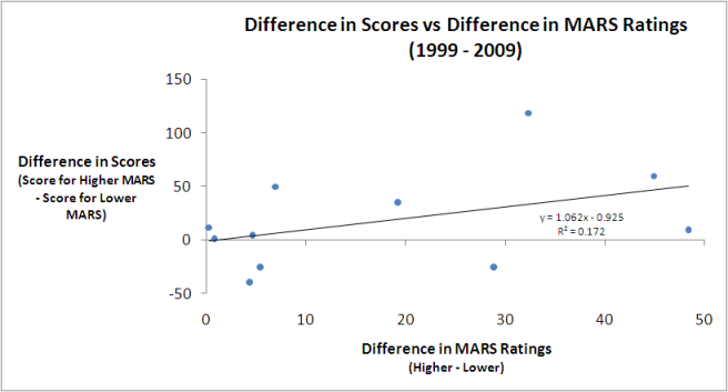
Adelaide's wins have come disproportionately often from presses in the 1st or 2nd quarters and relatively rarely from 2nd-Half Revivals or Coast-to-Coast results. They've had more than their expected share of losses of type Q2 Press Light, but less than their share of Q1 Press and Coast-to-Coast losses. In particular, they've suffered few Coast-to-Coast Blowout losses.

Brisbane have recorded an excess of Coast-to-Coast Comfortably and Blowout victories and less Q1 Press, Q3 Press and Coast-to-Coast Nail-Biters than might be expected. No game type has featured disproportionately more often amongst their losses, but they have had relatively few Q2 Press and Q3 Press losses.

Carlton has specialised in the Q2 Press victory type and has, relatively speaking, shunned Q3 Press and Coast-to-Coast Blowout victories. Their losses also include a disportionately high number of Q2 Press losses, which suggests that, over the broader time horizon of a decade, Carlton's fate has been more about how they've performed in the 2nd term. Carlton have also suffered a disproportionately high share of Coast-to-Coast Blowouts - which is I suppose what a Q2 Press loss might become if it gets ugly - yet have racked up fewer than the expected number of Coast-to-Coast Nail-Biters and Coast-to-Coast Comfortablys. If you're going to lose Coast-to-Coast, might as well make it a big one.

Collingwood's victories have been disproportionately often 2nd-Half Revivals or Coast-to-Coast Blowouts and not Q1 Presses or Coast-to-Coast Nail-Biters. Their pattern of losses has been partly a mirror image of their pattern of wins, with a preponderance of Q1 Presses and Coast-to-Coast Nail-Biters and a scarcity of 2nd-Half Revivals. They've also, however, had few losses that were Q2 or Q3 Presses or that were Coast-to-Coast Comfortablys.

Wins for Essendon have been Q1 Presses or Coast-to-Coast Nail-Biters unexpectedly often, but have been Q2 Press Lights or 2nd-Half Revivals significantly less often than for the average team. The only game type overrepresented amongst their losses has been the Coast-to-Coast Comfortably type, while Coast-to-Coast Blowouts, Q1 Presses and, especially, Q2 Presses have been signficantly underrepresented.

Fremantle's had a penchant for leaving their runs late. Amongst their victories, Q3 Presses and 2nd-Half Revivals occur more often than for the average team, while Coast-to-Coast Blowouts are relatively rare. Their losses also have a disproportionately high showing of 2nd-Half Revivals and an underrepresentation of Coast-to-Coast Blowouts and Coast-to-Coast Nail-Biters. It's fair to say that Freo don't do Coast-to-Coast results.

Geelong have tended to either dominate throughout a game or to leave their surge until later. Their victories are disproportionately of the Coast-to-Coast Blowout and Q3 Press varieties and are less likely to be Q2 Presses (Regular or Light) or 2nd-Half Revivals. Losses have been Q2 Press Lights more often than expected, and Q1 Presses, Q3 Presses or Coast-to-Coast Nail-Biters less often than expected.

Hawthorn have won with Q2 Press Lights disproportionately often, but have recorded 2nd-Half Revivals relatively infrequently and Q2 Presses very infrequently. Q2 Press Lights are also overrepresented amongst their losses, while Q2 Presses and Coast-to-Coast Nail-Biters appear less often than would be expected.

The Roos specialise in Coast-to-Coast Nail-Biter and Q2 Press Light victories and tend to avoid Q2 and Q3 Presses, as well as Coast-to-Coast Comfortably and Blowout victories. Losses have come disproportionately from the Q3 Press bucket and relatively rarely from the Q2 Press (Regular or Light) categories. The Roos generally make their supporters wait until late in the game to find out how it's going to end.

Melbourne heavily favour the Q2 Press Light style of victory and have tended to avoid any of the Coast-to-Coast varieties, especially the Blowout variant. They have, however, suffered more than their share of Coast-to-Coast Comfortably losses, but less than their share of Coast-to-Coast Blowout and Q2 Press Light losses.

Port Adelaide's pattern of victories has been a bit like Geelong's. They too have won disproportionately often via Q3 Presses or Coast-to-Coast Blowouts and their wins have been underrepresented in the Q2 Press Light category. They've also been particularly prone to Q2 and Q3 Press losses, but not to Q1 Presses or 2nd-Half Revivals.

Richmond wins have been disproportionately 2nd-Half Revivals or Coast-to-Coast Nail-Biters, and rarely Q1 or Q3 Presses. Their losses have been Coast-to-Coast Blowouts disproportionately often, but Coast-to-Coast Nail-Biters and Q2 Press Lights relatively less often than expected.

St Kilda have been masters of the foot-to-the-floor style of victory. They're overrepresented amongst Q1 and Q2 Presses, as well as Coast-to-Coast Blowouts, and underrepresented amongst Q3 Presses and Coast-to-Coast Comfortablys. Their losses include more Coast-to-Coast Nail-Biters than the average team, and fewer Q1 and Q3 Presses, and 2nd-Half Revivals.

Sydney's loss profile almost mirrors the average team's with the sole exception being a relative abundance of Q3 Presses. Their profile of losses, however, differs significantly from the average and shows an excess of Q1 Presses, 2nd-Half Revivals and Coast-to-Coast Nail-Biters, a relative scarcity of Q3 Presses and Coast-to-Coast Comfortablys, and a virtual absence of Coast-to-Coast Blowouts.

West Coast victories have come disproportionately as Q2 Press Lights and have rarely been of any other of the Press varieties. In particular, Q2 Presses have been relatively rare. Their losses have all too often been Coast-to-Coast blowouts or Q2 Presses, and have come as Coast-to-Coast Nail-Biters relatively infrequently.

The Western Bulldogs have won with Coast-to-Coast Comfortablys far more often than the average team, and with the other two varieties of Coast-to-Coast victories far less often. Their profile of losses mirrors that of the average team excepting that Q1 Presses are somewhat underrepresented.

We move now from associating teams with various game types to associating rounds of the season with various game types.

You might wonder, as I did, whether different parts of the season tend to produce a greater or lesser proportion of games of particular types. Do we, for example, see more Coast-to-Coast Blowouts early in the season when teams are still establishing routines and disciplines, or later on in the season when teams with no chance meet teams vying for preferred finals berths?

2010 - Game Type by Round 2001-2010.png

For this chart, I've divided the seasons from 2001 to 2010 into rough quadrants, each spanning 5 or 6 rounds.

The Coast-to-Coast Comfortably game type occurs most often in the early rounds of the season, then falls away a little through the next two quadrants before spiking a little in the run up to the finals.

The pattern for the Coast-to-Coast Nail-Biter game type is almost the exact opposite. It's relatively rare early in the season and becomes more prevalent as the season progresses through its middle stages, before tapering off in the final quadrant.

Coast-to-Coast Blowouts occur relatively infrequently during the first half of the season, but then blossom, like weeds, in the second half, especially during the last 5 rounds when they reach near-plague proportions.

Quarter 1 and Quarter 2 Presses occur with similar frequencies across the season, though they both show up slightly more often as the season progresses. Quarter 2 Press Lights, however, predominate in the first 5 rounds of the season and then decline in frequency across rounds 6 to 16 before tapering dramatically in the season's final quadrant.

Quarter 3 Presses occur least often in the early rounds, show a mild spike in Rounds 6 to 11, and then taper off in frequency across the remainder of the season. 2nd-Half Revivals show a broadly similar pattern.

Trialling The Super Smart Model

The best way to trial a potential Fund algorithm, I'm beginning to appreciate, is to publish each week the forecasts that it makes. This forces me to work through the mechanics of how it would be used in practice and, importantly, to set down what restrictions should be applied to its wagering - for example should it, like most of the current Funds, only bet on Home Teams, and in which round of the season should it start wagering.
Read More

What Do Bookies Know That We Don't?

Bookies, I think MAFL has comprehensively shown, know a lot about football, but just how much more do they know than what you or I might glean from a careful review of each team's recent results and some other fairly basic knowledge about the venues at which games are played?
Read More

There Must Be 50 Ways to Build a Model (Reprise)

Okay, this posting is going to be a lot longer and a little more technical than the average MAFL blog (and it's not as if the standard fare around here could be fairly characterised as short and simple).

Anyway, over the years of MAFL, people have asked me about the process of building a statistical model in sufficient number and with such apparent interest that I felt it was time to write a blog about it.

Step one in building a model is, as in life, finding a purpose and the purpose of the model I'll be building for this blog is to predict AFL victory margins, surely about as noble a purpose as a model can aspire to. Step two is deciding on the data that will be used to build that model, a decision heavily influenced by expedience; often it's more a case of 'what have I already got that might be predictive?' rather than 'what will I spend the next 4 weeks of my life trying to source because I've an inkling it might help?'.

Expediently enough, the model I'll be building here will use a single input variable: the TAB Sportsbet price of the home team, generally at noon on Wednesday before the game. I have this data going back to 1999, but I've personally recorded prices only since 2006. The remainder of the data I sourced from a website built to demonstrate the efficacy of the site-owner's subscription-based punting service, which makes me trust this data about as much as I trust on-site testimonials from 'genuine' customers. We'll just be using the data for the seasons 2006 to 2009.

Fitting the Simplest Model

The first statistical model I'll fit to the data is what's called an ordinary least-squares regression - surely a name to cripple the self-esteem of even the most robust modelling technique - and is of the form Predicted Margin = a + (b / Home Team Price).

The ordinary least-squares method chooses a and b to minimise the sum of the (squared) differences between the actual victory margin and that which would be predicted using it and, in this sense, 'fits' the data best of all the possible choices of a and b that we could make.

We've seen the result of fitting this model to the 2006-2009 data in an earlier blog where we saw that it was:

Predicted Margin = -49.17 + 96.31 / Home Team Price

This model fits the data for seasons 2006 to 2009 quite well. The most common measure of how well a model of this type fits is what's called the R-squared and, for this model, it's 0.236, meaning that the model explains a little less than one-quarter of the variability in margins across games.

But this is a difficult measure to which to attach any intuitive meaning. Better perhaps is to know that, on average, the predictions of this model are wrong by 29.3 points per game and that, for one-half of the games it is within 24.1 points of the actual result, and for 27% of the games it is within 12 points.

These results are all very promising but it would be a rookie mistake to start using this model in 2010 with the expectation that it will explain the future as well as it has explained the past. It's quite common for a statistical model to fit existing data well but to forecast as poorly as a surprised psychic ('Jeez, I didn't see that coming!').

Why? Because forecasting and fitting are two very different activities. When we build the model we deliberately make the fit as good as it can be and this can mean that the model we create doesn't faithfully represent the process that created that data. This is known in statistical circles - which, I guess, are only round on average - as 'overfitting' the data and it's one of the many things over which we obsess.

Overfitting is less likely to be a problem for the current model since it has only one variable in it and overfitting is more commonly a disease of multi-variable models, but it's something that it's always wise to check. A bit like checking that you've turned the stove off before you leave home.

Testing the Model

The biggest problem with modelling the future is that it hasn't happened yet (with apologies to whoever I stole or paraphrased that from). In modelling, however, we can create an artificial reality where, as far as our model's concerned, the future hasn't yet happened. We do this by fitting the model to just a part of the data we have, saving some for later as it were.

So, here we could fit the 2006 season's data and use the resulting model to predict the 2007 results. We could then repeat this by fitting a model to the 2007 data only and then use that model to predict the 2008 results, and then do something similar for 2009. Collectively, I'll call the models that I've fitted using this approach "Single Season" models.

Each Single Season model's forecasting ability can be calculated from the difference between the predictions it makes and the results of the games in the subsequent season. If the Single Season models overfit the data then they'll tend to fit the data well but predict the future badly.

The results of fitting and using the Single Season models are as follows:

2010 - Bookie Model Comparisons.png

The first column, for comparative purposes, shows the results for the simple model fitted to the entire data set (ie all of 2006 to 2009), and the next three columns show the results for each of the Single Season models. The final column averages the results for all the Single Season models and provides results that are the most directly comparable with those in the first column.

On balance, our fears of overfitting appear unfounded. The average and median prediction errors are very similar, although the Single Season models are a little worse at making predictions that are within 3 goals of the actual result. Still, the predictions they produce seem good enough.

What Is It Good For?

The Single Season approach looks promising. One way that it might have a practical value is if it can be used to predict the handicap winners of each game at a rate sufficient to turn a profit.

Unfortunately, it can't. In 2007 and 2008 it does slightly better than chance, predicting 51.4% of handicap winners, but in 2009 it predicts only 48.1% of winners. None of these performances is good enough to make money since, at $1.90 you need to tip at better than 52.6% to make money.

In retrospect, this is not entirely surprising. Using a bookie's own head-to-head prices to beat him on the line market would be just too outrageous.

Hmmm. What next then?

Working with Windows

Most data, in a modelling context, has a brief period of relevance that fades and, eventually, expires. In attempting to predict the result of this week's Geelong v Carlton game, for example, it's certainly relevant to know that Geelong beat St Kilda last week and that Carlton lost to Melbourne. It's also probably relevant to know that Geelong beat Carlton when they last played 11 weeks ago, but it's almost certainly irrelevant to know that Carlton beat Collingwood in 2007. Finessing this data relevance envelope by tweaking the weights of different pieces of data depending on their age is one of the black arts of modelling.

All of the models we've constructed so far in this blog have a distinctly black-and-white view of data. Every game in the data set that the model uses is treated equally regardless of whether it pertains to a game played last week, last month, or last season, and every game not in the data set is ignored.

There are a variety of ways to deal with this bipolarity, but the one I'll be using here for the moment is what I call the 'floating window' approach. Using it, a model is always constructed using the most recent X rounds of data. That model is then used to predict for just the current week then rebuilt next week for the subsequent week's action. So, for example, if we built a model with a 6-round floating window then, in looking to predict the results for Round 8 of a given season we'd use the results for Rounds 2 through 7 of that season. The next week we'd use the results for Rounds 3 through 8, and so on. For the early rounds of the season we'd reach back and use last year's results, including finals.

So, next, I've created 47 models using floating windows ranging from 6-round to 52-round. Their performance across seasons 2008 and 2009 is summarised in the following charts.

First let's look at the mean and median APEs:

2010 - Floating Window APE.png

Broadly what we see here is that, in terms of mean APE, larger floating windows are better than smaller ones, but the improvement is minimal from about an 11-round window onwards. The median APE story is quite different. There is a marked minimum with a 9-round floating window, and 8-round and 10-round floating windows also perform well.

Next let's take a look at how often the 47 models produce predictions close to the actual result:

2010 - Floating Window Accuracy.png

The top line charts the percentage of time that the relevant model produces predictions that are 3-goals or less distant from the actual result. The middle line is similarly constructed but for a 2-goal distance, and the bottom line is for a 1-goal distance.

Floating windows in the 8- to 11-round range all perform well on all three metrics, consistent with their strong performance in terms of median APE. The 16-round, 17-round and 18-round floating window models also perform well in terms of frequently producing predictions that are within 2-goals of the actual victory margin.

Next let's look at how often the 47 models produce predictions that are very wrong:

2010 - Floating Window Accuracy 36.png

In this chart, unlike the previous chart, lower is better. Here we again find that larger floating windows are better than smaller ones, but only to a point, the effect plateauing out with floating windows in the 30s

Again though to consider each model's potential punting value we can look at its handicap betting performance.

2010 - Floating Window Line.png

On this measure, only the model with an 11-round floating window seems to have any exploitable potential.

But, like Columbo, we just have one more question to ask of the data ...

Dynamic Weighted Floating Windows

(Warning: This next bit hurts my head too.)

We now have 47 floating window models offering an opinion on the likely outcomes of the games in any round. What if we pooled those opinions? But, not opinions are of equal value, so which opinions should we include and which should we ignore? What if we determined which opinions to pool based on the ability of different subsets of those 47 models to fit the results of, say, the last 26 rounds before the one we're trying to predict? And what if we updated those weights each round based on the latest results?

Okay, I've done all that (and yes it took a while to conceptualise and code, and my first version, previously published here, had an error that caused me to overstate the predictive power of one of the pooled models, but I got there eventually). Here's the APE data again now including a few extra models based on this pooling idea:

2010 - Floating Window APE with Dyn.png

(The dynamic floating window model results are labelled "Dynamic Linear I (22+35)" and "Dynamic Linear II (19+36+39+52)" The numbers in brackets are the Floating Window model forecasts that have been pooled to form the Dynamic Linear model. So, for example, the Dynamic Linear I model pools only the opinions of the Floating Window models based on a 22-round and a 35-round window. It determines how best to weight the opinions of these two Floating Window models by optimising over the past 26 rounds.

I've also shown the results for the Single Season models - they're labelled 'All of Prev Season' - and for a model that always uses all data from the start of 2006 up to but excluding the current round, labelled 'All to Current'.)

The mean APE results suggest that, for this performance metric at least, models with more data tend to perform better than models with less. The best Dynamic Linear model I could find, for all its sophistication still only managed to produce a mean APE 0.05 points per game lower than the simple model that used all the data since the start of 2006, weighting each game equally.

It is another Dynamic Linear model that shoots the lights out on the median APE results, however. The Dynamic Linear model that optimally combines the opinions of 19-, 36-, 39- and 52-round floating windows produces forecasts with a median APE of just 22.54 points per game.

The next couple of charts show that this superior performance stems from this Dynamic Linear model's all-around ability - it isn't best in terms of producing the most APEs under 7 points nor in terms of producing the fewest APEs of 36 points or more.

2010 - Floating Window Accuracy with Dyn.png
2010 - Floating Window Accuracy 36 with Dyn.png

Okay, here's the clincher. Do either of the Dynamic Linear models do much of a job predicting handicap winners?

2010 - Floating Window Line with Dyn.png

Nope. The best models for predicting handicap winners are the 11-round floating window model and the model formed by using all the data since the start of 2006. They each manage to be right just over 53% of the time - a barely exploitable edge.

The Moral So Far ...

What we've seen in these results is consistent with what I've found over the years in modelling the footy. Models tend to be highly specialised, so one that performs well in terms of, say, mean APE, won't perform well in terms of median APE.

Perhaps no surprise then that none of the models we've produced so far have been any good at predicting handicap margin winners. To build such a model we need to start out with that as the explicit modelling goal, and that's a topic for a future blog.

Predicting Margins Using Market Prices and MARS Ratings

Imagine that you allowed me to ask you for just one piece of data about an upcoming AFL game. Armed with that single piece of data I contend that I will predict the margin of that game and, on average, be within 5 goals of the actual margin. Further, one-half of the time I'll be within 4 goals of the final margin and one-third of the time I'll be within 3 goals. What piece of data do you think I am going to ask you for?

I'll ask you for the bookies' price for the home team, true or notional, I'll plug that piece of data into this equation:

Predicted Margin = -49.17 + 96.31 x (1 / Home Team Price)

(A positive margin means that the Home Team is predicted to win, a negative margin that the Away Team is predicted to win. So, at a Home Team price of $1.95 the Home Team is predicted to win; at $1.96 the Away Team is predicted to squeak home.)

Over the period 2006 to 2009 this simple equation has performed as I described in the opening paragraph and explains 23.6% of the variability in the victory margins across games.

Here's a chart showing the performance of this equation across seasons 2006 to 2009.

2010 Predicted v Actual Margin.png

The red line shows the margin predicted by the formula and the crosses show the actual results for each game. You can see that the crosses are fairly well described by the line, though the crosses are dense in the $1.50 to $2.00 range, so here's a chart showing only those games with a home team price of $4 or less.

How extraordinary to find a model so parsimonious yet so predictive. Those bookies do know a thing or two, don't they?

Now what if I was prohibited from asking you for any bookie-related data but, as a trade-off, was allowed two pieces of data rather than one? Well, then I'd be asking you for my MARS Ratings of the teams involved (though quite why you'd have my Ratings and I'd need to ask you for them spoils the narrative a mite).

The equation I'd use then would be the following:

Predicted Margin = -69.79 + 0.779 x MARS Rating of Home Team - 0.702 x MARS Rating of Away Team

Switching from the bookies' brains to my MARS' mindless maths makes surprisingly little difference. Indeed, depending on your criterion, the MARS Model might even be considered superior, your Honour.

The prosecution would point out that the MARS Model explains about 1.5% less of the overall variability in victory margins, but the case for the defence would counter that it predicts margins that are within 6 points of the actual margin over 15% of the time, more than 1.5% more often than the bookies' model does, and would also avow that the MARS model predictions are 6 goals or more different from the actual margin less often than are the predictions from the bookies' model.

So, if you're looking for a model that better fits the entire set of data, then percent of variability explained is your metric and the bookies' model is your winner. If, instead, you want a model that's more often very close to the true margin and less often very distant from it, then the MARS Model rules.

Once again we have a situation where a mathematical model, with no knowledge of player ins and outs, no knowledge of matchups or player form or player scandals, with nothing but a preternatural recollection of previous results, performs at a level around or even above that of an AFL-obsessed market-maker.

A concept often used in modelling is that of information. In the current context we can say that a bookie's home team price contains information about the likely victory margin. We can also say that my MARS ratings have information about likely victory margins too. One interesting question is does the bookie's price have essentially the same information as my MARS ratings or is there some additional information content in their combination?

To find out we fit a model using all three variables - the Home Team price, the Home Team MARS Rating, and the Away Team MARS Rating - and we find that all three variables are statistically significant at the 10% level. On that basis we can claim that all three variables contain some unique information that helps to explain a game's victory margin.

The model we get, which I'll call the Combined Model, is:

Predicted Margin = -115.63 + 67.02 / Home Team Price + 0.31 x MARS Rating of Home Team - 0.22 x MARS Rating of Away Team

A summary of this model and the two we covered earlier appears in the following table:

2010 Bookies v MARS.png

The Combined Model - the one that uses the bookie price and MARS ratings - explains over 24% of the variability in victory margin and has an average absolute prediction error of just 29.2 points. It produces these more accurate predictions not by being very close to the actual margin more often - in fact, it's within 6 points of the actual margin only about 13% of the time - but, instead, by being a long way from the actual margin less often.

Its margin prognostications are sufficiently accurate that, based on them, the winning team on handicap betting is identified a little over 53% of the time. Of course, it's one thing to fit a dataset that well and another thing entirely to convert that performance into profitable forecasts.

Losing Does Lead to Winning But Only for Home Teams (and only sometimes)

For reasons that aren't even evident to me, I decided to revisit the issue of "when losing leads to winning", which I looked at a few blogs back.

In that earlier piece no distinction was made between which team - home or away - was doing the losing or the winning. Such a distinction, it turns out, is important in uncovering evidence for the phenomenon in question.

Put simply, there is some statistical evidence across the home-and-away matches from 1980 to 2008 that home teams that trail by between 1 and 4 points at quarter time, or by 1 point at three-quarter time, tend to win more often than they lose. There is no such statistical evidence for away teams.

The table below shows the proportion of times that the home team has won when leading or trailing by the amount shown at quarter time, half time or three-quarter time.

Home_Team_Wins_By_Lead_Short.png

It shows, for example, that home teams that trailed by exactly 5 points at quarter time went on to win 52.5% of such games.

Using standard statistical techniques I've been able to determine, based on the percentages in the table and the number of games underpinning each percentage, how likely it is that the "true" proportion of wins by the home team is greater than 50% for any of the entries in the table for which the home team trails. That analysis, for example, tells us that we can be 99% confident (since the significance level is 1%) that the figure of 57.2% for teams trailing by 4 points at quarter time is statistically above 50%.

(To look for a losing leads to winning phenomenon amongst away teams I've performed a similar analysis on the rows where the home team is ahead and tested whether the proportion of wins by the home team is statistically significantly less than 50%. None of the entries was found to be significant.)

My conclusion then is that, in AFL, it's less likely that being slightly behind is motivational. Instead, it's that the home ground advantage is sufficient for the home team to overcome small quarter time or three-quarter time deficits. It's important to make one other point: though home teams trailing do, in some cases, win more often that they lose, they do so at a rate less than their overall winning rate, which is about 58.5%.

So far we've looked only at narrow leads and small deficits. While we're here and looking at the data in this way, let's broaden the view to consider all leads and deficits.

Home_Team_Wins_By_Lead_Long.png

In this table I've grouped leads and deficits into 5-point bands. This serves to iron out some of the bumps we saw in the earlier, more granular table.

A few things strike me about this table:

  • Home teams can expect to overcome a small quarter time deficit more often than not and need only be level at the half or at three-quarter time in order to have better than even chances of winning. That said, even the smallest of leads for the away team at three-quarter time is enough to shift the away team's chances of victory to about 55%.
  • Apparently small differences have significant implications for the outcome. A late goal in the third term to extend a lead from say 4 to 10 points lifts a team's chances - all else being equal - by 10% points if it's the home team (ie from 64% to 74%) and by an astonishing 16% points if it's the away team (ie from 64% to 80%).
  • A home team that leads by about 2 goals at the half can expect to win 8 times out of 10. An away team with such a lead with a similar lead can expect to win about 7 times out of 10.