2010: Just How Different Was It?

Last season I looked at Grand Final Typology. In this blog I'll start by presenting a similar typology for home-and-away games.

In creating the typology I used the same clustering technique that I used for Grand Finals - what's called Partitioning Around Medoids, or PAM - and I used similar data. Each of the 13,144 home-and-away season games was characterised by four numbers: the winning team's lead at quarter time, at half-time, at three-quarter time, and at full time.

With these four numbers we can calculate a measure of distance between any pair of games and then use the matrix of all these distances to form clusters or types of games.

After a lot of toing, froing, re-toing anf re-froing, I settled on a typology of 8 game types:

2010 - Types of Home and Away Game.png

Typically, in the Quarter 1 Press game type, the eventual winning team "presses" in the first term and leads by about 4 goals at quarter-time. At each subsequent change and at the final siren, the winning team typically leads by a little less than the margin it established at quarter-time. Generally the final margin is about about 3 goals. This game type occurs about 8% of the time.

In a Quarter 2 Press game type the press is deferred, and the eventual winning team typically trails by a little over a goal at quarter-time but surges in the second term to lead by four-and-a-half goals at the main break. They then cruise in the third term and extend their lead by a little in the fourth and ultimately win quite comfortably, by about six and a half goals. About 7% of all home-and-away games are of this type.

The Quarter 2 Press Light game type is similar to a Quarter 2 Press game type, but the surge in the second term is not as great, so the eventual winning team leads at half-time by only about 2 goals. In the second half of a Quarter 2 Press Light game the winning team provides no assurances for its supporters and continues to lead narrowly at three-quarter time and at the final siren. This is one of the two most common game types, and describes almost 1 in 5 contests.

Quarter 3 Press games are broadly similar to Quarter 1 Press games up until half-time, though the eventual winning team typically has a smaller lead at that point in a Quarter 3 Press game type. The surge comes in the third term where the winners typically stretch their advantage to around 7 goals and then preserve this margin until the final siren. Games of this type comprise about 10% of home-and-away fixtures.

2nd-Half Revival games are particularly closely fought in the first two terms with the game's eventual losers typically having slightly the better of it. The eventual winning team typically trails by less than a goal at quarter-time and at half-time before establishing about a 3-goal lead at the final change. This lead is then preserved until the final siren. This game type occurs about 13% of the time.

A Coast-to-Coast Nail-Biter is the game type that's the most fun to watch - provided it doesn't involve your team, especially if your team's on the losing end of one of these contests. In this game type the same team typically leads at every change, but by less than a goal to a goal and a half. Across history, this game type has made up about one game in six.

The Coast-to-Coast Comfortably game type is fun to watch as a supporter when it's your team generating the comfort. Teams that win these games typically lead by about two and a half goals at quarter-time, four and a half goals at half-time, six goals at three-quarter time, and seven and a half goals at the final siren. This is another common game type - expect to see it about 1 game in 5 (more often if you're a Geelong or a West Coast fan, though with vastly differing levels of pleasure depending on which of these two you support).

Coast-to-Coast Blowouts are hard to love and not much fun to watch for any but the most partial observer. They start in the manner of a Coast-to-Coast Comfortably game, with the eventual winner leading by about 2 goals at quarter time. This lead is extended to six and a half goals by half-time - at which point the word "contest" no longer applies - and then further extended in each of the remaining quarters. The final margin in a game of this type is typically around 14 goals and it is the least common of all game types. Throughout history, about one contest in 14 has been spoiled by being of this type.

Unfortunately, in more recent history the spoilage rate has been higher, as you can see in the following chart (for the purposes of which I've grouped the history of the AFL into eras each of 12 seasons, excepting the most recent era, which contains only 6 seasons. I've also shown the profile of results by game type for season 2010 alone).

2010 - Profile of Game Types by Era.png

The pies in the bottom-most row show the progressive growth in the Coast-to-Coast Blowout commencing around the 1969-1980 era and reaching its apex in the 1981-1992 era where it described about 12% of games.

In the two most-recent eras we've seen a smaller proportion of Coast-to-Coast Blowouts, but they've still occurred at historically high rates of about 8-10%.

We've also witnessed a proliferation of Coast-to-Coast Comfortably and Coast-to-Coast Nail-Biter games in this same period, not least of which in the current season where these game type descriptions attached to about 27% and 18% of contests respectively.

In total, almost 50% of the games this season were Coast-to-Coast contests - that's about 8 percentage points higher than the historical average.

Of the five non Coast-to-Coast game types, three - Quarter 2 Press, Quarter 3 Press and 2nd-half Revival - occurred at about their historical rates this season, while Quarter 1 Press and Quarter 2 Press Light game typesboth occurred at about 75-80% of their historical rates.

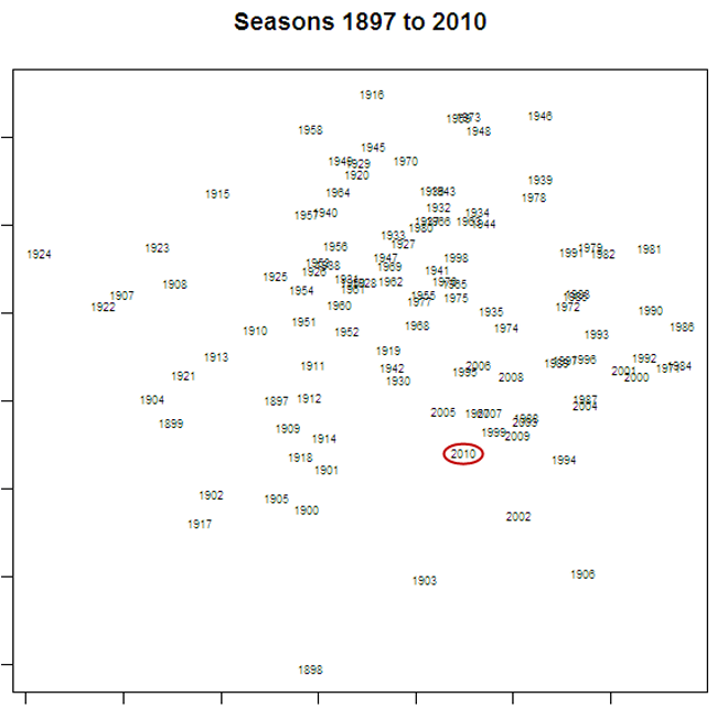
The proportion of games of each type in a season can be thought of as a signature of that season. being numeric, they provide a ready basis on which to measure how much one season is more or less like another. In fact, using a technique called principal components analysis we can use each season's signature to plot that season in two-dimensional space (using the first two principal components).

Here's what we get:

2010 - Home and Away Season Similarity.png

I've circled the point labelled "2010", which represents the current season. The further away is the label for another season, the more different is that season's profile of game types in comparison to 2010's profile.

So, for example, 2009, 1999 and 2005 are all seasons that were quite similar to 2010, and 1924, 1916 and 1958 are all seasons that were quite different. The table below provides the profile for each of the seasons just listed; you can judge the similarity for yourself.

2010 - Seasons Similar to 2010.png

Signatures can also be created for eras and these signatures used to represent the profile of game results from each era. If you do this using the eras as I've defined them, you get the chart shown below.

One way to interpret this chart is that there have been 3 super-eras in VFL/AFL history, the first spanning the seasons from 1897 to 1920, the second from 1921-1980, and the third from 1981-2010. In this latter era we seem to be returning to the profiles of the earliest eras, which was a time when 50% or more of all results were Coast-to-Coast game types.

2010 - Home and Away Era Similarity.png

Goalkicking Accuracy Across The Seasons

Last weekend's goal-kicking was strikingly poor, as I commented in the previous blog, and this led me to wonder about the trends in kicking accuracy across football history. Just about every sport I can think of has seen significant improvements in the techniques of those playing and this has generally led to improved performance. If that applies to football then we could reasonably expect to see higher levels of accuracy across time.
Read More

Scoring Shots: Not Just Another Statistic

For a while now I've harboured a suspicion that teams that trail at a quarter's end but that have had more scoring shots than their opponent have a better chance of winning than teams that trail by a similar amount but that have had fewer scoring shots than their opponent. Suspicions that are amenable to trial by data have a Constitutional right to their day in court, so let me take you through the evidence.
Read More

Grand Finals: Points Scoring and Margins

How would you characterise the Grand Finals that you've witnessed? As low-scoring, closely fought games; as high-scoring games with regular blow-out finishes; or as something else?

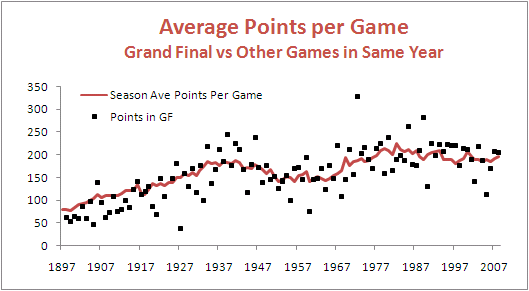
First let's look at the total points scored in Grand Finals relative to the average points scored per game in the season that immediately preceded them.

GF_PPG.png

Apart from a period spanning about the first 25 years of the competition, during which Grand Finals tended to be lower-scoring affairs than the matches that took place leading up to them, Grand Finals have been about as likely to produce more points than the season average as to produce fewer points.

One way to demonstrate this is to group and summarise the Grand Finals and non-Grand Finals by the decade in which they occurred.

GF_PPG_CHT.png

There's no real justification then, it seems, in characterising them as dour affairs.

That said, there have been a number of Grand Finals that failed to produce more than 150 points between the two sides - 49 overall, but only 3 of the last 30. The most recent of these was the 2005 Grand Final in which Sydney's 8.10 (58) was just good enough to trump the Eagles' 7.12 (54). Low-scoring, sure, but the sort of game for which the cliche "modern-day classic" was coined.

To find the lowest-scoring Grand Final of all time you'd need to wander back to 1927 when Collingwood 2.13 (25) out-yawned Richmond 1.7 (13). Collingwood, with efficiency in mind, got all of its goal-scoring out of the way by the main break, kicking 2.6 (20) in the first half. Richmond, instead, left something in the tank, going into the main break at 0.4 (4) before unleashing a devastating but ultimately unsuccessful 1.3 (9) scoring flurry in the second half.

That's 23 scoring shots combined, only 3 of them goals, comprising 12 scoring shots in the first half and 11 in the second. You could see that many in an under 10s soccer game most weekends.

Forty-five years later, in 1972, Carlton and Richmond produced the highest-scoring Grand Final so far. In that game, Carlton 28.9 (177) held off a fast-finishing Richmond 22.18 (150), with Richmond kicking 7.3 (45) to Carlton's 3.0 (18) in the final term.

Just a few weeks earlier these same teams had played out an 8.13 (63) to 8.13 (63) draw in their Semi Final. In the replay Richmond prevailed 15.20 (110) to Carlton's 9.15 (69) meaning that, combined, the two Semi Finals they played generated 22 points fewer than did the Grand Final.

From total points we turn to victory margins.

Here too, again save for a period spanning about the first 35 years of the competition during which GFs tended to be closer fought than the average games that had gone before them, Grand Finals have been about as likely to be won by a margin smaller than the season average as to be won by a greater margin.

GF_MPG.png

Of the 10 most recent Grand Finals, 5 have produced margins smaller than the season average and 5 have produced greater margins.

Perhaps a better view of the history of Grand Final margins is produced by looking at the actual margins rather than the margins relative to the season average. This next table looks at the actual margins of victory in Grand Finals summarised by decade.

GF_MOV.png

One feature of this table is the scarcity of close finishes in Grand Finals of the 1980s, 1990s and 2000s. Only 4 of these Grand Finals have produced a victory margin of less than 3 goals. In fact, 19 of the 29 Grand Finals have been won by 5 goals or more.

An interesting way to put this period of generally one-sided Grand Finals into historical perspective is provided by this, the final graphic for today.

GF_MOV_PC.png

They just don't make close Grand Finals like they used to.

Game Cadence

If you were to consider each quarter of football as a separate contest, what pattern of wins and losses do you think has been most common? Would it be where one team wins all 4 quarters and the other therefore losses all 4? Instead, might it be where teams alternated, winning one and losing the next, or vice versa? Or would it be something else entirely?

The answer, it turns out, depends on the period of history over which you ask the question. Here's the data:

Game Cadence.png

So, if you consider the entire expanse of VFL/AFL history, the egalitarian "WLWL / LWLW" cadence has been most common, occurring in over 18% of all games. The next most common cadence, coming in at just under 15% is "WWWW / LLLL" - the Clean Sweep, if you will. The next four most common cadences all have one team winning 3 quarters and the other winning the remaining quarter, each of which such cadences have occurred about 10-12% of the time. The other patterns have occurred with frequencies as shown under the 1897 to 2009 columns, and taper off to the rarest of all combinations in which 3 quarters were drawn and the other - the third quarter as it happens - was won by one team and so lost by the other. This game took place in Round 13 of 1901 and involved Fitzroy and Collingwood.

If, instead, you were only to consider more recent seasons excluding the current one, say from 1980 to 2008, you'd find that the most common cadence has been the Clean Sweep on about 18%, with the "WLLL / "LWWW" cadence in second on a little over 12%. Four other cadences then follow in the 10-11.5% range, three of them involving one team winning 3 of the 4 quarters and the other the "WLWL / LWLW" cadence.

In short it seems that teams have tended to dominate contests more in the 1980 to 2008 period than had been the case historically.

(It's interesting to note that, amongst those games where the quarters are split 2 each, "WLWL / LWLW" is more common than either of the two other possible cadences, especially across the entire history of footy.)

Turning next to the current season, we find that the Clean Sweep has been the most common cadence, but is only a little ahead of 5 other cadences, 3 of these involving a 3-1 split of quarters and 2 of them involving a 2-2 split.

So, 2009 looks more like the period 1980 to 2008 than it does the period 1897 to 2009.

What about the evidence for within-game momentum in the quarter-to-quarter cadence? In other words, are teams who've won the previous quarter more or less likely to win the next?

Once again, the answer depends on your timeframe.

Across the period 1897 to 2009 (and ignoring games where one of the two relevant quarters was drawn):

  • teams that have won the 1st quarter have also won the 2nd quarter about 46% of the time
  • teams that have won the 2nd quarter have also won the 3rd quarter about 48% of the time
  • teams that have won the 3rd quarter have also won the 4th quarter just under 50% of the time.

So, across the entire history of football, there's been, if anything, an anti-momentum effect, since teams that win one quarter have been a little less likely to win the next.

Inspecting the record for more recent times, however, consistent with our earlier conclusion about the greater tendency for teams to dominate matches, we find that, for the periods 1980 to 2008 (and, in brackets, for 2009):

  • teams that have won the 1st quarter have also won the 2nd quarter about 52% of the time a little less in 2009)
  • teams that have won the 2nd quarter have also won the 3rd quarter about 55% of the time (a little more in 2009)
  • teams that have won the 3rd quarter have also won the 4th quarter just under 55% of the time (but only 46% for 2009).

In more recent history then, there is evidence of within-game momentum.

All of which would lead you to believe that winning the 1st quarter should be particularly important, since it gets the momentum moving in the right direction right from the start. And, indeed, this season that has been the case, as teams that have won matches have also won the 1st quarter in 71% of those games, the greatest proportion of any quarter.

Does Losing Lead to Winning?

I was reading an issue of Chance News last night and came across the article When Losing Leads to Winning. In short, the authors of this journal article found that, in 6,300 or so most recent NCAA basketball games, teams that trailed by 1 point at half-time went on to win more games than they lost. This they attribute to "the motivational effects of being slightly behind".

Naturally, I wondered if the same effect existed for footy.

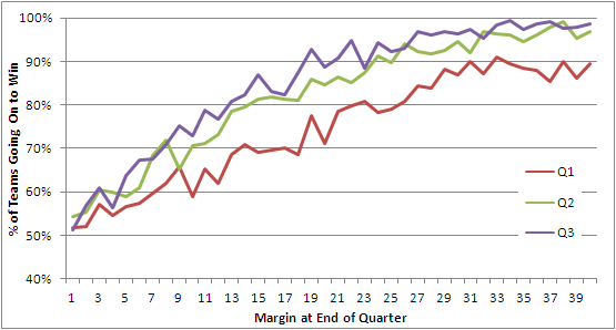
This first chart looks across the entire history of the VFL/AFL.

Leads and Winning - All Seasons.png

The red line charts the percentage of times that a team leading by a given margin at quarter time went on to win the game. You can see that, even at the leftmost extremity of this line, the proportion of victories is above 50%. So, in short, teams with any lead at quarter time have tended to win more than they've lost, and the larger the lead generally the greater proportion they've won. (Note that I've only shown leads from 1 to 40 points.)

Next, the green line charts the same phenomenon but does so instead for half-time leads. It shows the same overall trend but is consistently above the red line reflecting the fact that a lead at half-time is more likely to result in victory than is a lead of the same magnitude at quarter time. Being ahead is important; being ahead later in the game is more so.

Finally, the purple line charts the data for leads at three-quarter time. Once again we find that a given lead at three-quarter time is generally more likely to lead to victory than a similar lead at half-time, though the percentage point difference between the half-time and three-quarter lines is much less than that between the half-time and first quarter lines.

For me, one of the striking features of this chart is how steeply each line rises. A three-goal lead at quarter time has, historically, been enough to win around 75% of games, as has a two-goal lead at half-time or three-quarter time.

Anyway, there's no evidence of losing leading to winning if we consider the entire history of footy. What then if we look only at the period 1980 to 2008 inclusive?

Leads and Winning - 1980 to 2008.png

Now we have some barely significant evidence for a losing leads to winning hypothesis, but only for those teams losing by a point at quarter time (where the red line dips below 50%). Of the 235 teams that have trailed by one point at quarter time, 128 of them or 54.5% have gone on to win. If the true proportion is 50%, the likelihood of obtaining by chance a result of 128 or more wins is about 8.5%, so a statistician would deem that "significant" only if his or her preference was for critical values of 10% rather than the more standard 5%.

There is certainly no evidence for a losing leads to winning effect with respect to half-time or three-quarter time leads.

Before I created this second chart my inkling was that, with the trend to larger scores, larger leads would have been less readily defended, but the chart suggests otherwise. Again we find that a three-goal quarter time lead or a two-goal half-time or three-quarter time lead is good enough to win about 75% of matches.

Not content to abandon my preconception without a fight, I wondered if the period 1980 to 2008 was a little long and that my inkling was specific to more recent seasons. So, I divided up the 112-season history in 8 equal 14-year epochs and created the following table.

Leads and Winning - Table.png

The top block summarises the fates of teams with varying lead sizes, grouped into 5-point bands, across the 8 epochs. For example, teams that led by 1 to 5 points in any game played in the 1897 to 1910 period went on to win 55% of these games. Looking across the row you can see that this proportion has varied little across epochs never straying by more than about 3 percentage points from the all-season average of 54%.

There is some evidence in this first block that teams in the most-recent epoch have been better - not, as I thought, worse - at defending quarter time leads of three goals or more, but the evidence is slight.

Looking next at the second block there's some evidence of the converse - that is, that teams in the most-recent epoch have been poorer at defending leads, especially leads of a goal or more if you adjust for the distorting effect on the all-season average of the first two epochs (during which, for example, a four-goal lead at half-time should have been enough to send the fans to the exits).

In the third and final block there's a little more evidence of recent difficulty in defending leads, but this time it only relates to leads less than two goals at the final change.

All in all I'd have to admit that the evidence for a significant decline in the ability of teams to defend leads is not particularly compelling. Which, of course, is why I build models to predict football results rather than rely on my own inklings ...

Limning the Ladder

It's time to consider the grand sweep of football history once again.

This time I'm looking at the teams' finishing positions, in particular the number and proportion of times that they've each finished as Premiers, Wooden Spooners, Grand Finalists and Finalists, or that they've finished in the Top Quarter or Top Half of the draw.

Here's a table providing the All-Time data.

Teams_All_Time.png

Note that the percentage columns are all as a percentage of opportunities. So, for a season to be included in the denominator for a team's percentage, that team needs to have played in that season and, in the case of the Grand Finalists and Finalists statistics, there needs to have been a Grand Final (which there wasn't in 1897 or 1924) or there needs to have been Finals (which, effectively, there weren't in 1898, 1899 or 1900).

Looking firstly at Premierships, in pure number terms Essendon and Carlton tie for the lead on 16, but Essendon missed the 1916 and 1917 seasons and so have the outright lead in terms of percentage. A Premiership for West Coast in any of the next 5 seasons (and none for the Dons) would see them overtake Essendon on this measure.

Moving then to Spoons, St Kilda's title of the Team Most Spooned looks safe for at least another half century as they sit 13 clear of the field, and University will surely never relinquish the less euphonius but at least equally as impressive title of the Team With the Greatest Percentage of Spooned Seasons. Adelaide, Port Adelaide and West Coast are the only teams yet to register a Spoon (once the Roos' record is merged with North Melbourne's).

Turning next to Grand Finals we find that Collingwood have participated in a remarkable 39 of them, which equates to a better than one season in three record and is almost 10 percentage points better than any other team. West Coast, in just 22 seasons, have played in as many Grand Finals as have St Kilda, though St Kilda have had an additional 81 opportunities.

The Pies also lead in terms of the number of seasons in which they've participated in the Finals, though West Coast heads them in terms of percentages for this same statistic, having missed the Finals less than one season in four across the span of their existence.

Finally, looking at finishing in the Top Half or Top Quarter of the draw we find the Pies leading on both of these measures in terms of number of seasons but finishing runner-up to the Eagles in terms of percentages.

The picture is quite different if we look just at the 1980 to 2008 period, the numbers for which appear below.

Teams_80_08.png

Hawthorn now dominates the Premiership, Grand Finalist and finishing in the Top Quarter statistics. St Kilda still own the Spoon market and the Dons lead in terms of being a Finalist most often and finishing in the Top Half of the draw most often.

West Coast is the team with the highest percentage of Finals appearances and highest percentage of times finishing in the Top Half of the draw.

Percentage of Points Scored in a Game

We statisticians spend a lot of our lives dealing with the bell-shaped statistical distribution known as the Normal or Gaussian distribution. It describes a variety of phenomena in areas as diverse as physics, biology, psychology and economics and is quite frankly the 'go-to' distribution for many statistical purposes.

So, it's nice to finally find a footy phenomenon that looks Normally distributed.

The statistic is the percentage of points scored by each team is a game and the distribution of this statistic is shown for the periods 1897 to 2008 and 1980 to 2008 in the diagram below.

Percent_of_Points_Scored.png

Both distributions follow a Normal distribution quite well except in two regards:

  1. They fall off to zero in the "tails" faster than they should. In other words, there are fewer games with extreme results such as Team A scoring 95% of the points and Team B only 5% than would be the case if the distribution were strictly normal.
  2. There's a "spike" around 50% (ie for very close and drawn games) suggesting that, when games are close, the respective teams play in such a way as to preserve the narrowness of the margin - protecting a lead rather than trying to score more points when narrowly in front and going all out for points when narrowly behind.

Knowledge of this fact is unlikely to make you wealthy but it does tell us that we should expect approximately:

  • About 1 game in 3 to finish with one team scoring about 55% or more of the points in the game
  • About 1 game in 4 to finish with one team scoring about 58% or more of the points in the game
  • About 1 game in 10 to finish with one team scoring about 65% or more of the points in the game
  • About 1 game in 20 to finish with one team scoring about 70% or more of the points in the game
  • About 1 game in 100 to finish with one team scoring about 78% or more of the points in the game
  • About 1 game in 1,000 to finish with one team scoring about 90% or more of the points in the game

The most recent occurrence of a team scoring about 90% of the points in a game was back in Round 15 of 1989 when Essendon 25.10 (160) defeated West Coast 1.12 (18).

We're overdue for another game with this sort of lopsided result.

Teams' Performances Revisited

In a comment on the previous posting, Mitch asked if we could take a look at each team's performance by era, his interest sparked by the strong all-time performance of the Blues and his recollection of their less than stellar recent seasons.

Here's the data:

All_Time_WDL_by_Epoch.png

So, as you can see, Carlton's performance in the most recent epoch is significantly below its all-time performance. In fact, the 1993-2008 epoch is the only one in which the Blues failed to return a better than 50% performance.

Collingwood, the only team with a better lifetime record than Carlton, have also had a well below par last epoch during which they too have registered their first sub-50% performance, continuing a downward trend which started back in Epoch 2.

Six current teams have performed significantly better in the 1993-2008 epoch than their all-time performance: Geelong (who registered their best ever epoch), Sydney (who cracked 50% for the first time in four epochs), Brisbane (who could hardly but improve), the Western Bulldogs (who are still yet to break 50% for an epoch, their 1945-1960 figure being actually 49.5%), North Melbourne (who also registered their best ever epoch),  and St Kilda (who still didn't manage 50% for the epoch, a feat they've achieved only once).

Just before we wind up I should note that the 0% for University in Epoch 2 is not an error. It's the consequence of two 0 and 18 performances by Uni in 1913 and 1914 which, given that these followed directly after successive 1 and 17 performances in 1911 and 1912, unsurprisingly heralded the club's demise. Given that Uni's sole triumph of 1912 came in the third round, by my calculations that means University lost its final 51 matches.

Which Quarter Do Winners Win?

Today we'll revisit yet another chestnut and we'll analyse a completely new statistic.

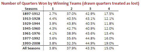
First, the chestnut: which quarter do winning teams win most often? You might recall that for the previous four seasons the answer has been the 3rd quarter, although it was a very close run thing last season, when the results for the 3rd and 4th quarters were nearly identical.

How then does the picture look if we go back across the entire history of the VFL/AFL?

Qtrs_Won_By_Winners.png

It turns out that the most recent epoch, spanning the seasons 1993 to 2008, has been one in which winning teams have tended to win more 3rd quarters than any other quarter. In fact, it was the quarter won most often in nine of those 16 seasons.

This, however, has not at all been the norm. In four of the other six epochs it has been the 4th quarter that winning teams have tended to win most often. In the other three epochs the 4th quarter has been the second most commonly won quarter.

But, the 3rd quarter has rarely been far behind the 4th, and its resurgence in the most recent epoch has left it narrowly in second place in the all-time statistics.

A couple of other points are worth making about the table above. Firstly, it's interesting to note how significantly more frequently winning teams are winning the 1st quarter than they have tended to in epochs past. Successful teams nowadays must perform from the first bounce.

Secondly, there's a clear trend over the past 4 epochs for winning teams to win a larger proportion of all quarters, from about 66% in the 1945 to 1960 epoch to almost 71% in the 1993 to 2008 epoch.

Now on to something a little different. While I was conducted the previous analysis, I got to wondering if there'd ever been a team that had won a match in which in had scored more points than its opponent in just a solitary quarter. Incredibly, I found that it's a far more common occurrence than I'd have estimated.

Number_Of_Qtrs_Won_By_Winners.png

The red line shows, for every season, the percentage of games in which the winner won just a solitary quarter (they might or might not have drawn any of the others). The average percentage across all 112 seasons is 3.8%. There were five such games last season, in four of which the winner didn't even manage to draw any of the other three quarters. One of these games was the Round 19 clash between Sydney and Fremantle in which Sydney lost the 1st, 2nd and 4th quarters but still got home by 2 points on the strength of a 6.2 to 2.5 3rd term.

You can also see from the chart the upward trend since about the mid 1930s in the percentage of games in which the winner wins all four quarters, which is consistent with the general rise, albeit much less steadily, in average victory margins over that same period that we saw in an earlier blog.

To finish, here's the same data from the chart above summarised by epoch:

Number_Of_Qtrs_Won_By_Winners_Table.png

Winners' Share of Scoring

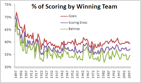
You might recall from seasons past my commenting on what I've claimed to be a startling regularity in AFL scoring, specifically, the proportion of scoring shots recorded by winning teams.

In 2008, winning teams racked up 57.3% of all scoring shots, while in 2007 the figure was 56.6%, and in 2006 it was 56.7%. Across the period 1999 to 2008 this percentage bounced around in a range between 56.4% and 57.8%. By any standard that's remarkable regularity.

I've recently come into possession of the scores for the entire history of the VFL/AFL competition in a readily analysable form - and by now you surely now how dangerous that's gotta be - so it seemed only natural to see if this regularity persisted into earlier seasons (assuming that it makes sense for something to persist into the past).

Below is a chart showing (in purple) the percentage of scoring shots registered by winning teams in each of the seasons 1897 through 2008. (The red line shows the proportion of goals that they scored, and the green line shows the proportion of behinds.)

Winners_Scoring.png

So, apart from the more extreme dominance of winning teams in the first decade or so of the competition, and a few other aberrant seasons over the next two decades, we have certainly seen remarkable stability in the percentage we've been discussing. Indeed, in the period 1927 to 2008, the percentage of scoring shots registered by winning teams has never been outside the range 55.0% to 59.6%. That surely almost establishes this phenomenon as a Law of Footy.

For those of you who prefer to digest your data in tabular form (preferably taken with meals), here's a decade-by-decade summary of the data.

Winners_Scoring_Table.png

The recent peak in winning teams' share of scoring was witnessed in 1995 and it came not as a consequence of a spike in 6-pointer dominance but instead from a spike in winning teams' share of behinds. In 1995 winning teams scored 57% of all behinds, which is about 2-4% higher than anything we've witnessed since. 1995 was the year that Carlton won the minor premiership kicking 317 behinds, Geelong finished runners-up kicking 338, and Richmond and Essendon, finishing in 3rd and 4th, kicked 600 more between them. By way of context, that's almost 75 more behinds than the top 4 of Geelong, Hawthorn, Western Bulldogs and St Kilda managed in 2008.

Regularity also aptly describes the history of the percentage of goals kicked by winning teams across the seasons (the red line in the chart). Again looking at the entire period since 1927, this percentage has never strayed from the righteous range of 57.0% to 61.8%.

Winning teams' share of behinds (the green line) has been, relatively speaking, quite variable, ranging from 51.9% to 58.2% in the period 1927 to the present, which once again demonstrates that it's goals and not behinds that win footy games.