A Proposition Bet on the Game Margin

We've not had a proposition bet for a while, so here's the bet and a spiel to go with it:

"If the margin at quarter time is a multiple of 6 points I'll pay you $5; if it's not, you pay me a $1. If the two teams are level at quarter-time it's a wash and neither of us pay the other anything.

Now quarter-time margins are unpredictable, so the probability of the margin being a multiple of 6 is 1-in-6, so my offering you odds of 5/1 makes it a fair bet, right? Actually, since goals are worth six points, you've probably got the better of the deal, since you'll collect if both teams kick the same number of behinds in the quarter.

Deal?"

At first glance this bet might look reasonable, but it isn't. I'll take you through the mechanics of why, and suggest a few even more lucrative variations.

Firstly, taking out the drawn quarter scenario is important. Since zero is divisible by 6 - actually, it's divisible by everything but itself - this result would otherwise be a loser for the bet proposer. Historically, about 2.4% of games have been locked up at the end of the 1st quarter, so you want those games off the table.

You could take the high moral ground on removing the zero case too, because your probability argument implicitly assumes that you're ignoring zeroes. If you're claiming that the chances of a randomly selected number being divisible by 6 is 1-in-6 then it's as if you're saying something like the following:

"Consider all the possible margins of 12 goals or less at quarter time. Now twelve of those margins - 6, 12, 18, 24, 30, 36, 42, 48, 54, 60, 66 and 72 - are divisible by 6, and the other 60, excluding 0, are not. So the chances of the margin being divisible by 6 are 12-in-72 or 1-in-6."

In running that line, though, I'm making two more implicit assumptions, one fairly obvious and the other more subtle.

The obvious assumption I'm making is that every margin is equally likely. Demonstrably, it's not. Smaller margins are almost universally more frequent than larger margins. Because of this, the proportion of games with margins of 1 to 5 points is more than 5 times larger than the proportion of games with margins of exactly 6 points, the proportion of games with margins of 7 to 11 points is more than 5 times larger than the proportion of games with margins of exactly 12 points, and so on. It's this factor that, primarily, makes the bet profitable.

The tendency for higher margins to be less frequent is strong, but it's not inviolate. For example, historically more games have had a 5-point margin at quarter time than a 4-point margin, and more have had an 11-point margin than a 10-point margin. Nonetheless, overall, the declining tendency has been strong enough for the proposition bet to be profitable as I've described it.

Here is a chart of the frequency distribution of margins at the end of the 1st quarter.

The far-less obvious assumption in my earlier explanation of the fairness of the bet is that the bet proposer will have exactly five-sixths of the margins in his or her favour; he or she will almost certainly have more than this, albeit only slightly more.

This is because there'll be a highest margin and that highest margin is more likely not to be divisible by 6 than it is to be divisible by 6. The simple reason for this is, as we've already noted, that only one-sixth of all numbers are divisible by six.

So if, for example, the highest margin witnessed at quarter-time is 71 points (which, actually, it is), then the bet proposer has 60 margins in his or her favour and the bet acceptor has only 11. That's 5 more margins in the proposer's favour than the 5/1 odds require, even if every margin was equally likely.

The only way for the ratio of margins in favour of the proposer to those in favour of the acceptor to be exactly 5-to-1 would be for the highest margin to be an exact multiple of 6. In all other cases, the bet proposer has an additional edge (though to be fair it's a very, very small one - about 0.02%).

So why did I choose to settle the bet at the end of the 1st quarter and not instead, say, at the end of the game?

Well, as a game progresses the average margin tends to increase and that reduces the steepness of the decline in frequency with increasing margin size.

Here's the frequency distribution of margins as at game's end.

(As well as the shallower decline in frequencies, note how much less prominent the 1-point game is in this chart compared to the previous one. Games that are 1-point affairs are good for the bet proposer.)

The slower rate of decline when using 4th-quarter rather than 1st-quarter margins makes the wager more susceptible to transient stochastic fluctuations - or what most normal people would call 'bad luck' - so much so that the wager would have been unprofitable in just over 30% of the 114 seasons from 1897 to 2010, including a horror run of 8 losing seasons in 13 starting in 1956 and ending in 1968.

Across all 114 seasons taken as a whole though it would also have been profitable. If you take my proposition bet as originally stated and assume that you'd found a well-funded, if a little slow and by now aged, footballing friend who'd taken this bet since the first game in the first round of 1897, you'd have made about 12c per game from him or her on average. You'd have paid out the $5 about 14.7% of the time and collected the $1 the other 85.3% of the time.

Alternatively, if you'd made the same wager but on the basis of the final margin, and not the margin at quarter-time, then you'd have made only 7.7c per game, having paid out 15.4% of the time and collected the other 84.6% of the time.

One way that you could increase your rate of return, whether you choose the 1st- or 4th-quarter margin as the basis for determining the winner, would be to choose a divisor higher than 6. So, for example, you could offer to pay $9 if the margin at quarter-time was divisible by 10 and collect $1 if it wasn't. By choosing a higher divisor you virtually ensure that there'll be sufficient decline in the frequencies that your wager will be profitable.

In this last table I've provided the empirical data for the profitability of every divisor between 2 and 20. For a divisor of N the bet is that you'll pay $N-1 if the margin is divisible by N and you'll receive $1 if it isn't. The left column shows the profit if you'd settled the bet at quarter-time, and the right column if you'd settled it all full-time.

As the divisor gets larger, the proposer benefits from the near-certainty that the frequency of an exactly-divisible margin will be smaller than what's required for profitability; he or she also benefits more from the "extra margins" effect since there are likely to be more of them and, for the situation where the bet is being settled at quarter-time, these extra margins are more likely to include a significant number of games.

Consider, for example, the bet for a divisor of 20. For that wager, even if the proportion of games ending the quarter with margins of 20, 40 or 60 points is about one-twentieth the total proportion ending with a margin of 60 points or less, the bet proposer has all the margins from 61 to 71 points in his or her favour. That, as it turns out, is about another 11 games, or almost 0.1%. Every little bit helps.

Which Teams Are Most Likely to Make Next Year's Finals?

I had a little time on a flight back to Sydney from Melbourne last Friday night to contemplate life's abiding truths. So naturally I wondered: how likely is it that a team finishing in ladder position X at the end of one season makes the finals in the subsequent season?

Here's the result for seasons 2000 to 2010, during which the AFL has always had a final 8:

2010 - Probability of Making the Finals by Ladder Position.png

When you bear in mind that half of the 16 teams have played finals in each season since 2000 this table is pretty eye-opening. It suggests that the only teams that can legitimately feel themselves to be better-than-random chances for a finals berth in the subsequent year are those that have finished in the top 4 ladder positions in the immediately preceding season. Historically, top 4 teams have made the 8 in the next year about 70% of the time - 100% of the time in the case of the team that takes the minor premiership.

In comparison, teams finishing 5th through 14th have, empirically, had roughly a 50% chance of making the finals in the subsequent year (actually, a tick under this, which makes them all slightly less than random chances to make the 8).

Teams occupying 15th and 16th have had very remote chances of playing finals in the subsequent season. Only one team from those positions - Collingwood, who finished 15th in 2005 and played finals in 2006 - has made the subsequent year's top 8.

Of course, next year we have another team, so that's even worse news for those teams that finished out of the top 4 this year.

Season 2010: An Assessment of Competitiveness

For many, the allure of sport lies in its uncertainty. It's this instinct, surely, that motivated the creation of the annual player drafts and salary caps - the desire to ensure that teams don't become unbeatable, that "either team can win on the day".

Objective measures of the competitiveness of AFL can be made at any of three levels: teams' competition wins and losses, the outcome of a game, or the in-game trading of the lead.

With just a little pondering, I came up with the following measures of competitiveness at the three levels; I'm sure there are more.

2010 - Measures of Competitiveness.png

We've looked at most - maybe all - of the Competition and Game level measures I've listed here in blogs or newsletters of previous seasons. I'll leave any revisiting of these measures for season 2010 as a topic for a future blog.

The in-game measures, though, are ones we've not explicitly explored, though I think I have commented on at least one occasion this year about the surprisingly high proportion of winning teams that have won 1st quarters and the low proportion of teams that have rallied to win after trailing at the final change.

As ever, history provides some context for my comments.

2010 - Number of Lead Changes.png

The red line in this chart records the season-by-season proportion of games in which the same team has led at every change. You can see that there's been a general rise in the proportion of such games from about 50% in the late seventies to the 61% we saw this year.

In recent history there have only been two seasons where the proportion of games led by the same team at every change has been higher: in 1995, when it was almost 64%, and in 1985 when it was a little over 62%. Before that you need to go back to 1925 to find a proportion that's higher than what we've seen in 2010.

The green, purple and blue lines track the proportion of games for which there were one, two, and the maximum possible three lead changes respectively. It's also interesting to note how the lead-change-at-every-change contest type has progressively disappeared into virtual non-existence over the last 50 seasons. This year we saw only three such contests, one of them (Fremantle v Geelong) in Round 3, and then no more until a pair of them (Fremantle v Geelong and Brisbane v Adelaide) in Round 20.

So we're getting fewer lead changes in games. When, exactly, are these lead changes not happening?

2010 - Lead Changes from One Quarter to the Next.png

Pretty much everywhere, it seems, but especially between the ends of quarters 1 and 2.

The top line shows the proportion of games in which the team leading at half time differs from the team leading at quarter time (a statistic that, as for all the others in this chart, I've averaged over the preceding 10 years to iron out the fluctuations and better show the trend). It's been generally falling since the 1960s excepting a brief period of stability through the 1990s that recent seasons have ignored, the current season in particular during which it's been just 23%.

Next, the red line, which shows the proportion of games in which the team leading at three-quarter time differs from the team leading at half time. This statistic has declined across the period roughly covering the 1980s through to 2000, since which it has stabilised at about 20%.

The navy blue line shows the proportion of games in which the winning team differs from the team leading at three-quarter time. Its trajectory is similar to that of the red line, though it doesn't show the jaunty uptick in recent seasons that the red line does.

Finally, the dotted, light-blue line, which shows the overall proportion of quarters for which the team leading at one break was different from the team leading at the previous break. Its trend has been downwards since the 1960s though the rate of decline has slowed markedly since about 1990.

All told then, if your measure of AFL competitiveness is how often the lead changes from the end of one quarter to the next, you'd have to conclude that AFL games are gradually becoming less competitive.

It'll be interesting to see how the introduction of new teams over the next few seasons affects this measure of competitiveness.

A Competition of Two Halves

In the previous blog I suggested that, based on winning percentages when facing finalists, the top 8 teams (well, actually the top 7) were of a different class to the other teams in the competition.

Current MARS Ratings provide further evidence for this schism. To put the size of the difference in an historical perspective, I thought it might be instructive to review the MARS Ratings of teams at a similar point in the season for each of the years 1999 to 2010.

(This also provides me an opportunity to showcase one of the capabilities - strip-charts - of a sparklines tool that can be downloaded for free and used with Excel.)

2010 - Spread of MARS Ratings by Year.png

In the chart, each row relates the MARS Ratings that the 16 teams had as at the end of Round 22 in a particular season. Every strip in the chart corresponds to the Rating of a single team, and the relative position of that strip is based on the team's Rating - the further to the right the strip is, the higher the Rating.

The red strip in each row corresponds to a Rating of 1,000, which is always the average team Rating.

While the strips provide a visual guide to the spread of MARS Ratings for a particular season, the data in the columns at right offer another, more quantitative view. The first column is the average Rating of the 8 highest-rated teams, the middle column the average Rating of the 8 lowest-rated teams, and the right column is the difference between the two averages. Larger values in this right column indicate bigger differences in the MARS Ratings of teams rated highest compared to those rated lowest.

(I should note that the 8 highest-rated teams will not always be the 8 finalists, but the differences in the composition of these two sets of eight team don't appear to be material enough to prevent us from talking about them as if they were interchangeable.)

What we see immediately is that the difference in the average Rating of the top and bottom teams this year is the greatest that it's been during the period I've covered. Furthermore, the difference has come about because this year's top 8 has the highest-ever average Rating and this year's bottom 8 has the lowest-ever average Rating.

The season that produced the smallest difference in average Ratings was 1999, which was the year in which 3 teams finished just one game out of the eight and another finished just two games out. That season also produced the all-time lowest rated top 8 and highest rated bottom 8.

While we're on MARS Ratings and adopting an historical perspective (and creating sparklines), here's another chart, this one mapping the ladder and MARS performances of the 16 teams as at the end of the home-and-away seasons of 1999 to 2010.

2010 - MARS and Ladder History - 1999-2010.png

One feature of this chart that's immediately obvious is the strong relationship between the trajectory of each team's MARS Rating history and its ladder fortunes, which is as it should be if the MARS Ratings mean anything at all.

Other aspects that I find interesting are the long-term decline of the Dons, the emergence of Collingwood, Geelong and St Kilda, and the precipitous rise and fall of the Eagles.

I'll finish this blog with one last chart, this one showing the MARS Ratings of the teams finishing in each of the 16 ladder positions across seasons 1999 to 2010.

2010 - MARS Ratings Spread by Ladder Position.png

As you'd expect - and as we saw in the previous chart on a team-by-team basis - lower ladder positions are generally associated with lower MARS Ratings.

But the "weather" (ie the results for any single year) is different from the "climate" (ie the overall correlation pattern). Put another way, for some teams in some years, ladder position and MARS Rating are measuring something different. Whether either, or neither, is measuring what it purports to -relative team quality - is a judgement I'll leave in the reader's hands.

Goalkicking Accuracy Across The Seasons

Last weekend's goal-kicking was strikingly poor, as I commented in the previous blog, and this led me to wonder about the trends in kicking accuracy across football history. Just about every sport I can think of has seen significant improvements in the techniques of those playing and this has generally led to improved performance. If that applies to football then we could reasonably expect to see higher levels of accuracy across time.
Read More

Scoring Shots: Not Just Another Statistic

For a while now I've harboured a suspicion that teams that trail at a quarter's end but that have had more scoring shots than their opponent have a better chance of winning than teams that trail by a similar amount but that have had fewer scoring shots than their opponent. Suspicions that are amenable to trial by data have a Constitutional right to their day in court, so let me take you through the evidence.
Read More

Using a Ladder to See the Future

The main role of the competition ladder is to provide a summary of the past. In this blog we'll be assessing what they can tell us about the future. Specifically, we'll be looking at what can be inferred about the make up of the finals by reviewing the competition ladder at different points of the season.

I'll be restricting my analysis to the seasons 1997-2009 (which sounds a bit like a special category for Einstein Factor, I know) as these seasons all had a final 8, twenty-two rounds and were contested by the same 16 teams - not that this last feature is particularly important.

Let's start by asking the question: for each season and on average how many of the teams in the top 8 at a given point in the season go on to play in the finals?

2010 - In Top 8.png

The first row of the table shows how many of the teams that were in the top 8 after the 1st round - that is, of the teams that won their first match of the season - went on to play in September. A chance result would be 4, and in 7 of the 13 seasons the actual number was higher than this. On average, just under 4.5 of the teams that were in the top 8 after 1 round went on to play in the finals.

This average number of teams from the current Top 8 making the final Top 8 grows steadily as we move through the rounds of the first half of the season, crossing 5 after Round 2, and 6 after Round 7. In other words, historically, three-quarters of the finalists have been determined after less than one-third of the season. The 7th team to play in the finals is generally not determined until Round 15, and even after 20 rounds there have still been changes in the finalists in 5 of the 13 seasons.

Last year is notable for the fact that the composition of the final 8 was revealed - not that we knew - at the end of Round 12 and this roster of teams changed only briefly, for Rounds 18 and 19, before solidifying for the rest of the season.

Next we ask a different question: if your team's in ladder position X after Y rounds where, on average, can you expect it to finish.

2010 - Ave Finish.png

Regression to the mean is on abundant display in this table with teams in higher ladder positions tending to fall and those in lower positions tending to rise. That aside, one of the interesting features about this table for me is the extent to which teams in 1st at any given point do so much better than teams in 2nd at the same point. After Round 4, for example, the difference is 2.6 ladder positions.

Another phenomenon that caught my eye was the tendency for teams in 8th position to climb the ladder while those in 9th tend to fall, contrary to the overall tendency for regression to the mean already noted.

One final feature that I'll point out is what I'll call the Discouragement Effect (but might, more cynically and possibly accurately, have called it the Priority Pick Effect), which seems to afflict teams that are in last place after Round 5. On average, these teams climb only 2 places during the remainder of the season.

Averages, of course, can be misleading, so rather than looking at the average finishing ladder position, let's look at the proportion of times that a team in ladder position X after Y rounds goes on to make the final 8.

2010 - Percent Finish in 8.png

One immediately striking result from this table is the fact that the team that led the competition after 1 round - which will be the team that won with the largest ratio of points for to points against - went on to make the finals in 12 of the 13 seasons.

You can use this table to determine when a team is a lock or is no chance to make the final 8. For example, no team has made the final 8 from last place at the end of Round 5. Also, two teams as lowly ranked as 12th after 13 rounds have gone on to play in the finals, and one team that was ranked 12th after 17 rounds still made the September cut.

If your team is in 1st or 2nd place after 10 rounds you have history on your side for them making the top 8 and if they're higher than 4th after 16 rounds you can sport a similarly warm inner glow.

Lastly, if your aspirations for your team are for a top 4 finish here's the same table but with the percentages in terms of making the Top 4 not the Top 8.

2010 - Percent Finish in 4.png

Perhaps the most interesting fact to extract from this table is how unstable the Top 4 is. For example, even as late as the end of Round 21 only 62% of the teams in 4th spot have finished in the Top 4. In 2 of the 13 seasons a Top 4 spot has been grabbed by a team in 6th or 7th at the end of the penultimate round.

Grand Final Typology

Today's blog looks at the typology of AFL Grand Finals. There are, it turns out, five basic types: (1) The Coast-to-Coast Coasting victory (2) The Come-From-Behind victory (3) The Game-of-Two-Halves Victory (4) The Coast-to-Coast Blowout Victory (5) The Nervous Start Victory
Read More

Grand Finals: Points Scoring and Margins

How would you characterise the Grand Finals that you've witnessed? As low-scoring, closely fought games; as high-scoring games with regular blow-out finishes; or as something else?

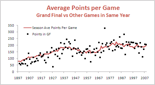
First let's look at the total points scored in Grand Finals relative to the average points scored per game in the season that immediately preceded them.

GF_PPG.png

Apart from a period spanning about the first 25 years of the competition, during which Grand Finals tended to be lower-scoring affairs than the matches that took place leading up to them, Grand Finals have been about as likely to produce more points than the season average as to produce fewer points.

One way to demonstrate this is to group and summarise the Grand Finals and non-Grand Finals by the decade in which they occurred.

GF_PPG_CHT.png

There's no real justification then, it seems, in characterising them as dour affairs.

That said, there have been a number of Grand Finals that failed to produce more than 150 points between the two sides - 49 overall, but only 3 of the last 30. The most recent of these was the 2005 Grand Final in which Sydney's 8.10 (58) was just good enough to trump the Eagles' 7.12 (54). Low-scoring, sure, but the sort of game for which the cliche "modern-day classic" was coined.

To find the lowest-scoring Grand Final of all time you'd need to wander back to 1927 when Collingwood 2.13 (25) out-yawned Richmond 1.7 (13). Collingwood, with efficiency in mind, got all of its goal-scoring out of the way by the main break, kicking 2.6 (20) in the first half. Richmond, instead, left something in the tank, going into the main break at 0.4 (4) before unleashing a devastating but ultimately unsuccessful 1.3 (9) scoring flurry in the second half.

That's 23 scoring shots combined, only 3 of them goals, comprising 12 scoring shots in the first half and 11 in the second. You could see that many in an under 10s soccer game most weekends.

Forty-five years later, in 1972, Carlton and Richmond produced the highest-scoring Grand Final so far. In that game, Carlton 28.9 (177) held off a fast-finishing Richmond 22.18 (150), with Richmond kicking 7.3 (45) to Carlton's 3.0 (18) in the final term.

Just a few weeks earlier these same teams had played out an 8.13 (63) to 8.13 (63) draw in their Semi Final. In the replay Richmond prevailed 15.20 (110) to Carlton's 9.15 (69) meaning that, combined, the two Semi Finals they played generated 22 points fewer than did the Grand Final.

From total points we turn to victory margins.

Here too, again save for a period spanning about the first 35 years of the competition during which GFs tended to be closer fought than the average games that had gone before them, Grand Finals have been about as likely to be won by a margin smaller than the season average as to be won by a greater margin.

GF_MPG.png

Of the 10 most recent Grand Finals, 5 have produced margins smaller than the season average and 5 have produced greater margins.

Perhaps a better view of the history of Grand Final margins is produced by looking at the actual margins rather than the margins relative to the season average. This next table looks at the actual margins of victory in Grand Finals summarised by decade.

GF_MOV.png

One feature of this table is the scarcity of close finishes in Grand Finals of the 1980s, 1990s and 2000s. Only 4 of these Grand Finals have produced a victory margin of less than 3 goals. In fact, 19 of the 29 Grand Finals have been won by 5 goals or more.

An interesting way to put this period of generally one-sided Grand Finals into historical perspective is provided by this, the final graphic for today.

GF_MOV_PC.png

They just don't make close Grand Finals like they used to.

A First Look at Grand Final History

In Preliminary Finals since 2000 teams finishing in ladder position 1 are now 3-0 over teams finishing 3rd, and teams finishing in ladder position 2 are 5-0 over teams finishing 4th.

Overall in Preliminary Finals, teams finishing in 1st now have a 70% record, teams finishing 2nd an 80% record, teams finishing 3rd a 38% record, and teams finishing 4th a measly 20% record. This generally poor showing by teams from 3rd and 4th has meant that we've had at least 1 of the top 2 teams in every Grand Final since 2000.

Finals_Summary_Wk3.png

Reviewing the middle table in the diagram above we see that there have been 4 Grand Finals since 2000 involving the teams from 1st and 2nd on the ladder and these contests have been split 2 apiece. No other pairing has occurred with a greater frequency.

Two of these top-of-the-table clashes have come in the last 2 seasons, with 1st-placed Geelong defeating 2nd-placed Port Adelaide in 2007, and 2nd-placed Hawthorn toppling 1st-placed Geelong last season. Prior to that we need to go back firstly to 2004, when 1st-placed Port Adelaide defeated 2nd-placed Brisbane Lions, and then to 2001 when 1st-placed Essendon surrendered to 2nd-placed Brisbane Lions.

Ignoring the replays of 1948 and 1977 there have been 110 Grand Finals in the 113-year history of the VFL/AFL history, with Grand Finals not being used in the 1897 or 1924 seasons. The pairings and win-loss records for each are shown in the table below.

GF_Records.png

As you can see, this is the first season that St Kilda have met Geelong in the Grand Final. Neither team has been what you'd call a regular fixture at the G come Grand Final Day, though the Cats can lay claim to having been there more often (15 times to the Saints' 5) and to having a better win-loss percentage (47% to the Saints' 20%).

After next weekend the Cats will move ahead of Hawthorn into outright 7th in terms of number of GF appearances. Even if they win, however, they'll still trail the Hawks by 2 in terms of number of Flags.

What Price the Saints to Beat the Cats in the GF?

If the Grand Final were to be played this weekend, what prices would be on offer?

We can answer this question for the TAB Sportsbet bookie using his prices for this week's games, his prices for the Flag market and a little knowledge of probability.

Consider, for example, what must happen for the Saints to win the flag. They must beat the Dogs this weekend and then beat whichever of the Cats or the Pies wins the other Preliminary Final. So, there are two mutually exclusive ways for them to win the Flag.

In terms of probabilities, we can write this as:

Prob(St Kilda Wins Flag) =

Prob(St Kilda Beats Bulldogs) x Prob (Geelong Beats Collingwood) x Prob(St Kilda Beats Geelong) +

Prob(St Kilda Beats Bulldogs) x Prob (Collingwood Beats Geelong) x Prob(St Kilda Beats Collingwood)

We can write three more equations like this, one for each of the other three Preliminary Finalists.

Now if we assume that the bookie's overround has been applied to each team equally then we can, firstly, calculate the bookie's probability of each team winning the Flag based on the current Flag market prices which are St Kilda $2.40; Geelong $2.50; Collingwood $5.50; and Bulldogs $7.50.

If we do this, we obtain:

  • Prob(St Kilda Wins Flag) = 36.8%
  • Prob(Geelong Wins Flag) = 35.3%
  • Prob(Collingwood Wins Flag) = 16.1%
  • Prob(Bulldogs Win Flag) = 11.8%

Next, from the current head-to-head prices for this week's games, again assuming equally applied overround, we can calculate the following probabilities:

  • Prob(St Kilda Beats Bulldogs) = 70.3%
  • Prob(Geelong Beats Collingwood) = 67.8%

Armed with those probabilities and the four equations of the form of the one above in bold we come up with a set of four equations in four unknowns, the unknowns being the implicit bookie probabilities for all the possible Grand Final matchups.

To lapse into the technical side of things for a second, we have a system of equations Ax = b that we want to solve for x. But, it turns out, the A matrix is rank-deficient. Mathematically this means that there are an infinite number of solutions for x; practically it means that we need to define one of the probabilities in x and we can then solve for the remainder.

Which probability should we choose?

I feel most confident about setting a probability - or a range of probabilities - for a St Kilda v Geelong Grand Final. St Kilda surely would be slight favourites, so let's solve the equations for Prob(St Kilda Beats Geelong) equal to 51% to 57%.

Each column of the table above provides a different solution and is obtained by setting the probability in the top row and then solving the equations to obtain the remaining probabilities.

The solutions in the first 5 columns all have the same characteristic, namely that the Saints are considered more likely to beat the Cats than they are to beat the Pies. To steal a line from Get Smart, I find that hard to believe, Max.

Inevitably then we're drawn to the last two columns of the table, which I've shaded in gray. Either of these solutions, I'd contend, are valid possibilities for the TAB Sportsbet bookie's true current Grand Final matchup probabilities.

If we turn these probabilities into prices, add a 6.5% overround to each, and then round up or down as appropriate, this gives us the following Grand Final matchup prices.

St Kilda v Geelong

  • $1.80/$1.95 or $1.85/$1.90

St Kilda v Collingwood

  • $1.75/$2.00 or $1.70/$2.10

Geelong v Bulldogs

  • $1.50/$2.45 or $1.60/$2.30

Collingwood v Bulldogs

  • $1.65/$2.20 or $1.50/$2.45

MARS Ratings of the Finalists

We've had a cracking finals series so far and there's the prospect of even better to come. Two matches that stand out from what we've already witnessed are the Lions v Carlton and Collingwood v Adelaide games. A quick look at the Round 22 MARS ratings of these teams tells us just how evenly matched they were.

MARS_Finalists_F2.png

Glancing down to the bottom of the 2009 column tells us a bit more about the quality of this year's finalists.

As a group, their average rating is 1,020.8, which is the 3rd highest average rating since season 2000, behind only the averages for 2001 and 2003, and weighed down by the sub-1000 rating of the eighth-placed Dons.

At the top of the 8, the quality really stands out. The top 4 teams have the highest average rating for any season since 2000, and the top 5 teams are all rated 1,025 or higher, a characteristic also unique to 2009.

Someone from among that upper eschelon had to go out in the first 2 weeks and, as we now know, it was Adelaide, making them the highest MARS rated team to finish fifth at the end of the season.

MARS_Finalists_F2_2.png

(Adelaide aren't as unlucky as the Carlton side of 2001, however, who finished 6th with a MARS Rating of 1,037.9)

A Decade of Finals

This year represents the 10th under the current system of finals, a system I think has much to recommend it. It certainly seems to - justifiably, I'd argue - favour those teams that have proven their credentials across the entire season.

The table below shows how the finals have played out over the 10 years:

Finals_2009_W1.png

This next table summarises, on a one-week-of-the-finals-at-a-time basis, how teams from each ladder position have fared:

Finals_Summary_Wk1.png

Of particular note in relation to Week 1 of the finals is the performance of teams finishing 3rd and of those finishing 7th. Only two such teams - one from 3rd and one from 7th - have been successful in their respective Qualifying and Elimination Finals.

In the matchups of 1st v 4th and 5th v 8th the outcomes have been far more balanced. In the 1st v 4th clashes, it's been the higher ranked team that has prevailed on 6 of 10 occasions, whereas in the 5th v 8th clashes, it's been the lower ranked team that's won 60% of the time.

Turning our attention next to Week 2 of the finals, we find that the news isn't great for Adelaide or Lions fans. On both those occasions when 4th has met 5th in Week 2, the team from 4th on the ladder has emerged victorious, and on the 7 occasions that 3rd has faced 6th in Week 2, the team from 3rd on the ladder has won 5 and lost only 2.

Looking more generally at the finals, it's interesting to note that no team from ladder positions 5, 7 or 8 has made it through to the Preliminary Finals and, on the only two occasions that the team from position 6 has made it that far, none has progressed into the Grand Final.

So, teams only from positions 1 to 4 have so far contested Grand Finals, teams from 1st on 6 occasions, teams from 2nd on 7 occasions, teams from 3rd on 3 occasions, and teams from 4th only twice.

No team finishing lower than 3rd has yet won a Flag.

The Decline of the Humble Behind

Last year, you might recall, a spate of deliberately rushed behinds prompted the AFL to review and ultimately change the laws relating to this form of scoring.

Has the change led to a reduction in the number of behinds recorded in each game? The evidence is fairly strong:

Goals and Behinds.png

So far this season we've seen 22.3 behinds per game, which is 2.6 per game fewer than we saw in 2008 and puts us on track to record the lowest number of average behinds per game since 1915. Back then though goals came as much more of a surprise, so a spectator at an average game in 1915 could expect to witness only 16 goals to go along with the 22 behinds. Happy days.

This year's behind decline continues a trend during which the number of behinds per game has dropped from a high of 27.3 per game in 1991 to its current level, a full 5 behinds fewer, interrupted only by occasional upticks such as the 25.1 behinds per game recorded in 2007 and the 24.9 recorded in 2008.

While behind numbers have been falling recently, goals per game have also trended down - from 29.6 in 1991, to this season's current average of 26.8. Still, AFL followers can expect to witness more goals than behinds in most games they watch. This wasn't always the case. Not until the season of 1969 had there been a single season with more goals than behinds, and not until 1976 did such an outcome became a regular occurrence. In only one season since then, 1981, have fans endured more behinds than goals across the entire season.

On a game-by-game basis, 90 of 128 games this season, or a smidge over 70%, have produced more goals than behinds. Four more games have produced an equal number of each.

As a logical consequence of all these trends, behinds have had a significantly smaller impact on the result of games, as evidenced by the chart below which shows the percentage of scoring attributable to behinds falling from above 20% in the very early seasons to around 15% across the period 1930 to 1980, to this season's 12.2%, the second-lowest percentage of all time, surpassed only by the 11.9% of season 2000.

Behinds PC.png

(There are more statistical analyses of the AFL on MAFL Online's sister site at MAFL Stats.)

Limning the Ladder

It's time to consider the grand sweep of football history once again.

This time I'm looking at the teams' finishing positions, in particular the number and proportion of times that they've each finished as Premiers, Wooden Spooners, Grand Finalists and Finalists, or that they've finished in the Top Quarter or Top Half of the draw.

Here's a table providing the All-Time data.

Teams_All_Time.png

Note that the percentage columns are all as a percentage of opportunities. So, for a season to be included in the denominator for a team's percentage, that team needs to have played in that season and, in the case of the Grand Finalists and Finalists statistics, there needs to have been a Grand Final (which there wasn't in 1897 or 1924) or there needs to have been Finals (which, effectively, there weren't in 1898, 1899 or 1900).

Looking firstly at Premierships, in pure number terms Essendon and Carlton tie for the lead on 16, but Essendon missed the 1916 and 1917 seasons and so have the outright lead in terms of percentage. A Premiership for West Coast in any of the next 5 seasons (and none for the Dons) would see them overtake Essendon on this measure.

Moving then to Spoons, St Kilda's title of the Team Most Spooned looks safe for at least another half century as they sit 13 clear of the field, and University will surely never relinquish the less euphonius but at least equally as impressive title of the Team With the Greatest Percentage of Spooned Seasons. Adelaide, Port Adelaide and West Coast are the only teams yet to register a Spoon (once the Roos' record is merged with North Melbourne's).

Turning next to Grand Finals we find that Collingwood have participated in a remarkable 39 of them, which equates to a better than one season in three record and is almost 10 percentage points better than any other team. West Coast, in just 22 seasons, have played in as many Grand Finals as have St Kilda, though St Kilda have had an additional 81 opportunities.

The Pies also lead in terms of the number of seasons in which they've participated in the Finals, though West Coast heads them in terms of percentages for this same statistic, having missed the Finals less than one season in four across the span of their existence.

Finally, looking at finishing in the Top Half or Top Quarter of the draw we find the Pies leading on both of these measures in terms of number of seasons but finishing runner-up to the Eagles in terms of percentages.

The picture is quite different if we look just at the 1980 to 2008 period, the numbers for which appear below.

Teams_80_08.png

Hawthorn now dominates the Premiership, Grand Finalist and finishing in the Top Quarter statistics. St Kilda still own the Spoon market and the Dons lead in terms of being a Finalist most often and finishing in the Top Half of the draw most often.

West Coast is the team with the highest percentage of Finals appearances and highest percentage of times finishing in the Top Half of the draw.

Percentage of Points Scored in a Game

We statisticians spend a lot of our lives dealing with the bell-shaped statistical distribution known as the Normal or Gaussian distribution. It describes a variety of phenomena in areas as diverse as physics, biology, psychology and economics and is quite frankly the 'go-to' distribution for many statistical purposes.

So, it's nice to finally find a footy phenomenon that looks Normally distributed.

The statistic is the percentage of points scored by each team is a game and the distribution of this statistic is shown for the periods 1897 to 2008 and 1980 to 2008 in the diagram below.

Percent_of_Points_Scored.png

Both distributions follow a Normal distribution quite well except in two regards:

  1. They fall off to zero in the "tails" faster than they should. In other words, there are fewer games with extreme results such as Team A scoring 95% of the points and Team B only 5% than would be the case if the distribution were strictly normal.
  2. There's a "spike" around 50% (ie for very close and drawn games) suggesting that, when games are close, the respective teams play in such a way as to preserve the narrowness of the margin - protecting a lead rather than trying to score more points when narrowly in front and going all out for points when narrowly behind.

Knowledge of this fact is unlikely to make you wealthy but it does tell us that we should expect approximately:

  • About 1 game in 3 to finish with one team scoring about 55% or more of the points in the game
  • About 1 game in 4 to finish with one team scoring about 58% or more of the points in the game
  • About 1 game in 10 to finish with one team scoring about 65% or more of the points in the game
  • About 1 game in 20 to finish with one team scoring about 70% or more of the points in the game
  • About 1 game in 100 to finish with one team scoring about 78% or more of the points in the game
  • About 1 game in 1,000 to finish with one team scoring about 90% or more of the points in the game

The most recent occurrence of a team scoring about 90% of the points in a game was back in Round 15 of 1989 when Essendon 25.10 (160) defeated West Coast 1.12 (18).

We're overdue for another game with this sort of lopsided result.

Teams' Performances Revisited

In a comment on the previous posting, Mitch asked if we could take a look at each team's performance by era, his interest sparked by the strong all-time performance of the Blues and his recollection of their less than stellar recent seasons.

Here's the data:

All_Time_WDL_by_Epoch.png

So, as you can see, Carlton's performance in the most recent epoch is significantly below its all-time performance. In fact, the 1993-2008 epoch is the only one in which the Blues failed to return a better than 50% performance.

Collingwood, the only team with a better lifetime record than Carlton, have also had a well below par last epoch during which they too have registered their first sub-50% performance, continuing a downward trend which started back in Epoch 2.

Six current teams have performed significantly better in the 1993-2008 epoch than their all-time performance: Geelong (who registered their best ever epoch), Sydney (who cracked 50% for the first time in four epochs), Brisbane (who could hardly but improve), the Western Bulldogs (who are still yet to break 50% for an epoch, their 1945-1960 figure being actually 49.5%), North Melbourne (who also registered their best ever epoch),  and St Kilda (who still didn't manage 50% for the epoch, a feat they've achieved only once).

Just before we wind up I should note that the 0% for University in Epoch 2 is not an error. It's the consequence of two 0 and 18 performances by Uni in 1913 and 1914 which, given that these followed directly after successive 1 and 17 performances in 1911 and 1912, unsurprisingly heralded the club's demise. Given that Uni's sole triumph of 1912 came in the third round, by my calculations that means University lost its final 51 matches.

Teams' All-Time Records

At this time of year, before we fixate on the week-to-week triumphs and travesties of yet another AFL season, it's interesting to look at the varying fortunes of all the teams that have ever competed in the VFL/AFL.

The table below provides the Win, Draw and Loss records of every team.

All_Time_WDL.png

As you can see, Collingwood has the best record of all the teams having won almost 61% of all the games in which it has played, a full 1 percentage point better than Carlton, in second. Collingwood have also played more games than any other team and will be the first team to have played in 2,300 games when Round 5 rolls around this year.

Amongst the relative newcomers to the competition, West Coast and Port Adelaide - and to a lesser extent, Adelaide - have all performed well having won considerably more than half of their matches.

Sticking with newcomers but dipping down to the other end of the table we find Fremantle with a particularly poor record. They've won just under 40% of their games and, remarkably, have yet to register a draw. (Amongst current teams, Essendon have recorded the highest proportion of drawn games at 1.43%, narrowly ahead of Port Adelaide with 1.42%. After Fremantle, the team with the next lowest proportion of drawn games is Adelaide at 0.24%. In all, 1.05% of games have finished with scores tied.)

Lower still we find the Saints, a further 1.3 percentage points behind Fremantle. It took St Kilda 48 games before it registered its first win in the competition, which should surely have been some sort of a hint to fans of the pain that was to follow across two world wars and a depression (maybe two). Amongst those 112 seasons of pain there's been just the sole anaesthetising flag, in 1966.

Here then are a couple of milestones that we might witness this year that will almost certainly go unnoticed elsewhere:

  • Collingwood's 2,300th game (and 1,400th win or, if the season's a bad one for them, 900th loss)
  • Carlton's 900th loss
  • West Coast's 300th win
  • Port Adelaide's 300th game
  • Geelong's and Sydney's 2,200th game
  • Adelaide's 200th loss
  • Richmond's 1,000th loss (if they fail to win more than one match all season)
  • Fremantle's 200th loss

Granted, few of those are truly banner events, but if AFL commentators were as well supported by statisticians as, say, Major League Baseball, you can bet they'd get a mention, much as equally arcane statistics are sprinkled liberally in the 3 hours of dead time there is between pitches.

Which Quarter Do Winners Win?

Today we'll revisit yet another chestnut and we'll analyse a completely new statistic.

First, the chestnut: which quarter do winning teams win most often? You might recall that for the previous four seasons the answer has been the 3rd quarter, although it was a very close run thing last season, when the results for the 3rd and 4th quarters were nearly identical.

How then does the picture look if we go back across the entire history of the VFL/AFL?

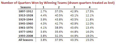
Qtrs_Won_By_Winners.png

It turns out that the most recent epoch, spanning the seasons 1993 to 2008, has been one in which winning teams have tended to win more 3rd quarters than any other quarter. In fact, it was the quarter won most often in nine of those 16 seasons.

This, however, has not at all been the norm. In four of the other six epochs it has been the 4th quarter that winning teams have tended to win most often. In the other three epochs the 4th quarter has been the second most commonly won quarter.

But, the 3rd quarter has rarely been far behind the 4th, and its resurgence in the most recent epoch has left it narrowly in second place in the all-time statistics.

A couple of other points are worth making about the table above. Firstly, it's interesting to note how significantly more frequently winning teams are winning the 1st quarter than they have tended to in epochs past. Successful teams nowadays must perform from the first bounce.

Secondly, there's a clear trend over the past 4 epochs for winning teams to win a larger proportion of all quarters, from about 66% in the 1945 to 1960 epoch to almost 71% in the 1993 to 2008 epoch.

Now on to something a little different. While I was conducted the previous analysis, I got to wondering if there'd ever been a team that had won a match in which in had scored more points than its opponent in just a solitary quarter. Incredibly, I found that it's a far more common occurrence than I'd have estimated.

Number_Of_Qtrs_Won_By_Winners.png

The red line shows, for every season, the percentage of games in which the winner won just a solitary quarter (they might or might not have drawn any of the others). The average percentage across all 112 seasons is 3.8%. There were five such games last season, in four of which the winner didn't even manage to draw any of the other three quarters. One of these games was the Round 19 clash between Sydney and Fremantle in which Sydney lost the 1st, 2nd and 4th quarters but still got home by 2 points on the strength of a 6.2 to 2.5 3rd term.

You can also see from the chart the upward trend since about the mid 1930s in the percentage of games in which the winner wins all four quarters, which is consistent with the general rise, albeit much less steadily, in average victory margins over that same period that we saw in an earlier blog.

To finish, here's the same data from the chart above summarised by epoch:

Number_Of_Qtrs_Won_By_Winners_Table.png

Is the Competition Getting More Competitive?

We've talked before about the importance of competitiveness in the AFL and the role that this plays in retaining fans' interest because they can legitimately believe that their team might win this weekend (Melbourne supporters aside).

Last year we looked at a relatively complex measure of competitiveness that was based on the notion that competitive balance should produce competition ladders in which the points are spread across teams rather than accruing disproportionately to just a few. Today I want to look at some much simpler diagnostics based on margins of victory.

Firstly, let's take a look at the average victory margin per game across every season of the VFL/AFL.

Average_Victory_Margin.png

The trend since about the mid 1950s has been increasing average victory margins, though this seems to have been reversed at least a little over the last decade or so. Notwithstanding this reversal, in historical terms, we saw quite high average victory margins in 2008. Indeed, last year's average margin of 35.9 points was the 21st highest of all time.

Looking across the last decade, the lowest average victory margin came in 2002 when it was only 31.7 points, a massive 4 points lower than we saw last year. Post WWII, the lowest average victory margin was 23.2 points in 1957, which was the season in which Melbourne took the minor premiership with 12-1-5 record.

Averages can, of course, be heavily influenced by outliers, in particular by large victories. One alternative measure of the closeness of games that avoids these outliers is the proportion of games that are decided by less than a goal or two. The following chart provides information about such measures. (The purple line shows the percentage of games won by 11 points or fewer and the green line shows the percentage of games won by 5 points or fewer. Both include draws.)

Close_Games.png

Consistent with what we found in the chart of average victory margins we can see here a general trend towards fewer close games since about the mid 1950s. We can also see an increase in the proportion of close games in the last decade.

Again we also find that, in historical terms, the proportion of close games that we're seeing is relatively low. The proportion of games that finished with a margin of 5 points or fewer in 2008 was just 10.8%, which ranks equal 66th (from 112 seasons). The proportion that finished with a margin of 11 points or fewer was just 21.1%, which ranks an even lowlier 83rd.

On balance then I think you'd have to conclude that the AFL competition is not generally getting closer though there are some signs that the situation has been improving in the last decade or so.