2012 - Recent History of MARS Ratings and Ladder Positions
/This year we finished the home-and-away season with 11 teams carrying MARS Ratings of over 1,000, hinting at the competitiveness we saw for positions in the Finals. MARS Ratings are zero-sum though, so a large crop of highly-rated teams necessitates a smaller crop of lowly-rated ones, which you see in the following stripe chart along with some historical context.
(When interpreting MARS Ratings for 2012 bear in mind that GWS started the season with a Rating of 900, not 1,000, so the average team Rating in 2012 was marginally lower than for all other years shown. This is why the red line for 2012, which depicts that average, is slightly to the left of the other red lines.)
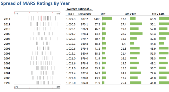
The columns on the right of the strip chart provide some quantitative sense of the comparative spread of team Ratings. Firstly, the average Rating of the Finalists in each season is shown and then, next to this, the average Rating of all non-Finalists, and the difference between these two Ratings. This provides a first gross measure of the disparity in the strength of these two groups of teams; you can see that this measure has been growing for the past five seasons, alarmingly so in the most recent two years.
Next is the difference between the Ratings of the teams finishing 4th and 8th, which we can think of as a measure of the likely competitiveness of the Finals. In historical terms this measure is relatively low this year, the lowest it's been since 2007, which augurs well for the next few weeks.
Finally there's another gross measure of the imbalance in team strengths, this one excluding the possibly distorting impacts of a handful of especially strong or especially weak teams. This measure has also been trending upwards over recent seasons and has this year attained an 11-season high.
It's also interesting to review the relationship between MARS Ratings and ladder positions across the seasons, which this next chart does:

Reinforcing, in a slightly different manner, the imbalance we spoke of earlier, of the top 10 teams based on 2012 ladder position, nine of them had above-average Ratings for their ladder position, the exception being Adelaide who finished almost 15 RPs below the average for teams that have finished 2nd on the ladder. Six of the next seven teams finished Rated below the average Rating for teams in their ladder position, Richmond being the exception now having finished Rated over 17 RPs higher than the average Rating for teams finishing 12th on the ladder.
(For the sheer fun of it, I had Eureqa II fit a curve to the ladder position and average MARS Rating data in the chart above - essentially, drawing a curve through the red lines - and came up with the following logistic:
Expected Ladder Position = 17.28 * logistic(59.67 - 0.0597 * MARS Rating)
The R-squared for that equation, fitted to ladder positions 1 to 17, is 0.996.)
The detail of MARS Rating by ladder position for each of the last 14 seasons appears in this next table:


Lastly, let's chart each team's end of home-and-away season MARS Rating and ladder position, and calculate the correlation between the two:
A visual scan of the pairs of lines for each team is enough to suggest a strong relationship between MARS Rating and ladder position - an intuition which the correlation coefficients merely confirm. The weakest relationships are for Fremantle and Sydney, and even for them the shared variability is almost 60%.
One thing that strikes me about this chart is the apparent regression towards the mean this season for many teams (though a few have overshot). A quick calculation shows that eleven of the seventeen teams for which it makes sense to calculate the metric are, in absolute terms, Rated closer to 1,000 this season than they were last season.
