MAFL 2013 : Team Dashboard for Round 23
/Before providing the final Team Dashboard of the season I want to present a summary view of each team's performance this season, which I've done by creating a bubble chart where the area is proportional to the victory margin in the relevant game and the colour reflects the result from the viewpoint of the Home team.
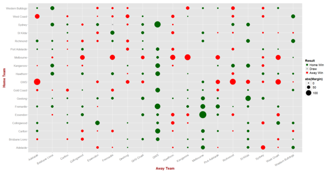 One aspect of the season that I think this chart makes particularly clear is the general narrowness of the Roos' defeats. To see this, peruse the collection of small, red circles on the row labelled "Kangaroos" and the assemblage of small, green circles - which also denote Roos losses - in the column labelled similarly.
Also highlighted by this chart is the magnitude of many GWS and Melbourne losses and, more subtly, the inequity of the home-and-away clashes that were missed as a consequence of the non all-plays-all home-and-away nature of the AFL draw. Which team wouldn't, for example, want one of those large green circles that proliferate in the columns labelled "GWS" or "Melbourne"?
With that by way of entree, here's the season's final Team Dashboard:
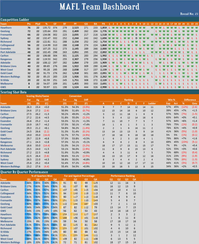 (I've left the Dons in 7th though I realise that, officially, they'll finish 9th.)
The Roos, therefore, have missed out on a place in the Finals despite finishing the season having scored, on average, about 20% more points than their opponents, ranking them 5th amongst all teams, while Port Adelaide have made it after racking up only a bit over 2% more points than they conceded.
Somewhat unusually, half of the teams that have lived to fight another week found themselves on the end of a loss this week, while five of the teams that won't participate in the Finals were victorious. The end of any AFL season is often a curious time ...
At the end of the home-and-away season only two teams have recorded more than two wins fewer than would have been expected based on their scoring shot data and MAFL's Win Production Function: Adelaide, who recorded 2.6 wins fewer, and the Roos, who recorded over 5 wins fewer. No team recorded more than 1.6 wins more than would have been expected, and half of the teams finished within 1 win - plus or minus - of the number we'd have expected.
Hawthorn finished the home-and-away season as the team generating the greatest number of scoring shots per game, while the Dees finished as the team generating the fewest. Fremantle conceded the fewest and GWS the greatest number per game.
Fremantle also recorded the highest scoring shot conversion rate, and Carlton the lowest, while GWS allowed the greatest proportion of scoring shots to be converted to goals and Carlton allowed the smallest proportion - how else could the Blues have hoped to have made the Finals given their own inability to convert?
The Roos were best at 1st Quarters, Sydney at 2nd Quarters, Geelong at 3rd Quarters, and Port Adelaide at 4th Quarters, while worst, respectively, were the Dogs, Dees, Giants and the Saints.
Rank correlations between final ladder position and ranking on the various metrics were as follows:
- Competition Ladder vs Own Scoring Shot production: +0.78
- Competition Ladder vs Opponent Scoring Shot production: +0.90
- Competition Ladder vs Own Conversion rate: +0.52
- Competition Ladder vs Opponent Conversion rate: +0.29
- Competition Ladder vs Q1 Performances: +0.76
- Competition Ladder vs Q2 Performances: +0.95
- Competition Ladder vs Q3 Performances: +0.74
- Competition Ladder vs Q4 Performances: +0.56
This year, it seems, success was very much about ensuring that opponent's scoring opportunities were hard to convert and about performing especially well in 2nd terms.