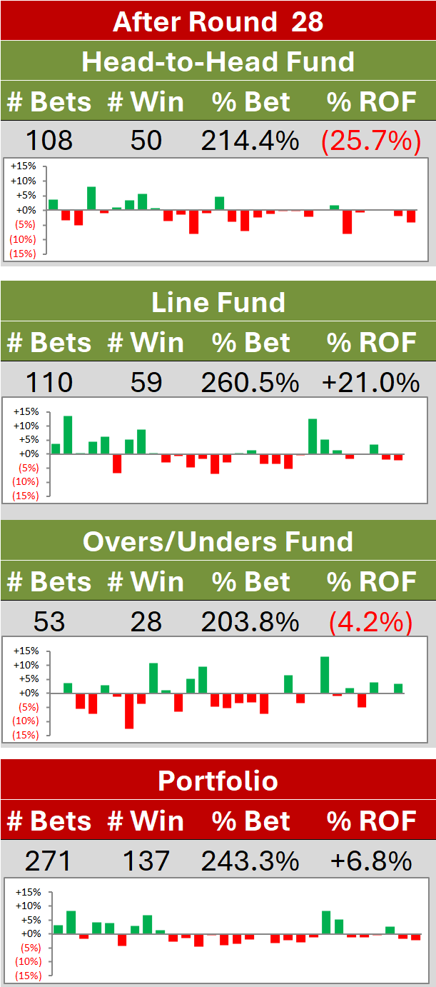
The Changing Nature of Home Team Probability
/The original motivation for this blog was to provide additional context for a previous blog on victory probabilities for portions of games. That blog looked at the relationship between the TAB Bookmaker's pre-game assessment of the Home team's chances and the subsequent success or otherwise of the Home team in portions - Quarters, Halfs and so on - of the game under review.
In that blog I provided a few statistics about the distribution across games of Home Teams' Implicit Probabilities, but no chart. So, firstly, let me remedy that.

What you're seeing here is a histogram of the actual Implicit Home Team Probabilities for all games between 2006 and 2012, overlaid with a smoothed density function fitted to the same data.
The slight skew in the density reflects the fact that Home teams, on average, have tended to start as slight favourites: the average Implicit Home Team Probability across the period has been 55.2%, the median 56.6%, the standard deviation 22.0%, and the skewness -0.227.
For the histogram I've chosen 5% binwidths, and the noticeable gap mid-distribution is for the 60-65% range, which equates to prices of about $1.55 to $1.65 assuming a 5% vig. Only 84 of the 1,329 games in the sample, or about 6%, had Implicit Home Team Probabilities in that range. By comparison, in this same sample, 107 games had Probabilities in the 55-60% range and 108 had Probabilities in the 65-70% range.
(By the way, the R code to produce this chart was:
ggplot(fd, aes(x=Home_Implicit_Prob)) +
scale_x_continuous("Implicit Home Team Probability") + scale_y_continuous("Density") +
geom_histogram(aes(y=..density..), binwidth=.05, colour="black", fill="white") +
geom_density(alpha=.2, fill="#FF6666") +
ggtitle("Density for Home Team Implicit Probability (2006-2012)") +
theme(axis.title.x = element_text(face="bold", colour="#990000", size=20),
axis.text.x = element_text(size=16), axis.text.y = element_text(size=16),
axis.title.y = element_text(face="bold", colour="#990000", size=20),
legend.position = "none",
plot.title = element_text(face="bold", size=24))
)
THE SEASON-BY-SEASON VIEW
The previous chart combined all the games from the period 2006 to 2012; the season-by-season view is very different.

Each chart here is for a single season and again I've provided the histogram and the smoothed density.
What's most notable as we move down through the seasons starting with 2006 at the top and ending with 2012 at the bottom, is the general flattening of the distribution.
In earlier seasons, when teams were more evenly matched and home ground advantage was significant, the distribution of Implicit Home Team Probabilities was especially concentrated in the 50-75% range. Now, most notably in 2012, the distribution is fleeing for the edges and we see a slew of very short-priced and another slew of relatively unfancied Home teams.
This flattening has not changed everything about the distributions. The average Home Team Implicit Probability has barely changed, moving from 54.9% in 2006 to 54.8% in 2012, and the median's been equally stable, altering from 57.4% to 57.7%. The standard deviation, however, has exploded - from 18.2% to 27.3%.
(The only difference between the R code for this chart and that for the earlier chart is the addition of the following command:+ facet_grid(Season ~ .) )
A chart that, arguably, does a better job of highlighting this phenomenon is the following, which combines boxplots with a jittered version of the underlying data.
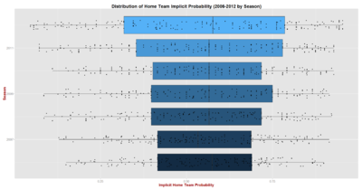
In this chart time runs upward, so the lowest boxplot is for 2006 and the highest is for 2012.
The size of the box for each season reflects the "interquartile range" of Home Team Implicit Probabilities for that season - that is, the range of Probabilities, symmetric about the median, that encompasses 50% of the values.
It's apparent that the distribution of Implicit Probabilities for 2011 and for 2012 - not coincidentally the seasons where the AFL added first the Gold Coast and then GWS - are substantively different from the five preceding seasons.
(The R code for this chart replaces the histogram and density geoms in the earlier chart with
+ geom_boxplot() + geom_jitter(position = position_jitter(width = .2)) + coord_flip()
The width = 0.2 ensures that the jittered values stay inside the edges of the box in each season, and the coord_flip() produces a "landscape" style chart rather than the default "portrait" style.)